| Image |
Comment |
| 07/28/2003 12:25:36 PM |
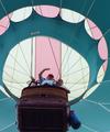
Up Up and Awayby TerryGeeComment by jdavis: Neat shot. I would like it better if the faces and the bottom of the basket weren't so dark. Good job |
| 07/28/2003 08:02:24 AM |
|
| 07/21/2003 03:10:20 PM |
|
| 07/18/2003 12:35:29 AM |
|
| 07/17/2003 10:04:18 PM |
|
| 07/17/2003 09:46:26 AM |
|
| 07/17/2003 06:56:21 AM |
|
| 07/16/2003 12:51:25 PM |
|
| 07/16/2003 10:11:37 AM |
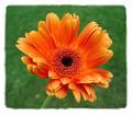
In The Centerby TerryGeeComment by DragonBro: I'm not hot on the border you put on it, and it would have been better if the flower were more spirical. |
| 07/16/2003 09:04:37 AM |
In The Centerby TerryGeeComment by BobsterLobster: *Sigh*. Why do people insist on ruining their pictures with these borders? When the eye is taken away from the picture because the border is more interesting, the border is not doing it's job. A shame, because this is a good picture, nice colours, great light, perfect saturation, spot-on dof. 7 |
Home -
Challenges -
Community -
League -
Photos -
Cameras -
Lenses -
Learn -
Help -
Terms of Use -
Privacy -
Top ^
DPChallenge, and website content and design, Copyright © 2001-2026 Challenging Technologies, LLC.
All digital photo copyrights belong to the photographers and may not be used without permission.
Current Server Time: 07/21/2026 07:36:37 PM EDT.