| Image |
Comment |
| 12/31/2003 01:51:10 PM |
|
| 12/30/2003 09:18:14 AM |
|
| 12/30/2003 07:46:51 AM |
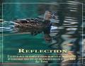
Reflectionby TerryGeeComment by PaulMdx: Fantastic colour of the water. I hope that's real! I'm not at all keen on the text however, sorry. Especially on the words "Reflection" and "words" at the end it's very difficult to read. I would have been tempted to use a solid border. Good effort. |
| 12/29/2003 09:48:40 PM |
Reflectionby TerryGeeComment by Shelley: Nice photo, but the words get hard to read, especially on the right. It might have been better to put the works on a solid background. |
| 12/29/2003 01:12:38 PM |
|
| 12/29/2003 06:59:11 AM |
Reflectionby TerryGeeComment by kaycee: This is really gorgeous. The one thing I'd change, however, would be to make the smaller text upper/lower case. I come from a background of typography, and it is proven that upper/lower mix is easier to read than all caps. |
| 12/29/2003 05:38:57 AM |
Reflectionby TerryGeeComment by timmi: Gorgeous photo and reflection. Love the colours and the composition is very good. I do not like the text in all caps, as it is very hard to read. Sometimes it is a good technique to darken the background behind the text a bit with a faded layer to make the text stand out from the busy background. This actually looks like a pro poster and I like it over all. |
| 12/28/2003 10:32:47 PM |
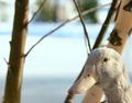
Winter Bluesby TerryGeeComment by Neuferland: Greetings from the Critique Club!
Hi! I really like this shot but then again anything with an animal automatically gets extra points from me, LOL!
You are right in that you probably lost points for not having the water as the main focus but the clarity on the duck is amazing and the overall DOF works very well for this shot. I like the cropping on the right side, you are brought into the shot by either corner, the tree in the upper corner, the duck's neck in the lower corner. The left side leaves me a bit disoriented though. I put my hand up trying to see what might make it work a little better for me and I'm thinking just a little tighter crop, either so the tree borders the left side or crop right inside the tree so the water is all on the left seems a bit more composed to me.
The lighting and shadows on this shot are wonderful, I love sunlight shots too.
Hope this helps!
Good Luck In Future Challenges!
Deannda
DNeufer@stny.rr.com if you have any questions or want to discuss this further! |
| 12/28/2003 09:26:13 PM |
Sticky Situationby TerryGeeComment by Dave Gordon: I don't know if there's any way to avoid it, but the out-of-focus spines at the front detract from what is otherwise a great picture. |
| 12/28/2003 05:46:56 PM |
Sticky Situationby TerryGeeComment by dr rick: Interesting shapes and nice contrasting background. Depth of field is a bit narrow; it would be better if the main stems were better focused (although the out of focus foreground works great). And a closer shot would have been more appropriate for a Macro challenge. |
Home -
Challenges -
Community -
League -
Photos -
Cameras -
Lenses -
Learn -
Help -
Terms of Use -
Privacy -
Top ^
DPChallenge, and website content and design, Copyright © 2001-2026 Challenging Technologies, LLC.
All digital photo copyrights belong to the photographers and may not be used without permission.
Current Server Time: 07/17/2026 07:29:44 AM EDT.