| Image |
Comment |
| 10/13/2004 10:56:42 PM |
|
 Photographer found comment helpful. Photographer found comment helpful. |
| 10/13/2004 11:11:21 AM |
|
| Photographer found comment helpful. |
| 10/13/2004 09:35:53 AM |
|
| Photographer found comment helpful. |
| 10/13/2004 09:18:55 AM |
|
| Photographer found comment helpful. |
| 10/13/2004 08:49:31 AM |
|
| 10/13/2004 03:59:00 AM |
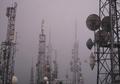
Broadcastingby KatrankaComment by Artyste: This is a shot with some great potential. The composition here, however, just doesn't do much for me. The towers in the mist, however, is very eerie in a "machines will take over the earth" type of way. |
| 10/12/2004 09:11:58 PM |
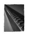
Heaterby KatrankaComment by photom: Your diagional composition works. The print is a bit muddy. The biggest problem is the presentation as your border is just plain bad. |
| 10/12/2004 03:44:08 PM |
Heaterby KatrankaComment by techtraum: I like the photograph for the submission, however, I don't feel the border adds anything to the composition of the shot. If anything it is detracting. |
| 10/12/2004 01:02:55 PM |
Heaterby KatrankaComment by Dr.Confuser: The border turns me off a bit. It's well balanced enough, like a good mat, but the photo edges are a bit cliched. Against the stark white, the body of the photo looks dim by comparison. The diagonal composition is the trickiest composition for me and I have a lot of trouble making it work. In this case, it doesn't help highlight the subject very well. Sorry to seem negative. I'm relatively new to this so these are just my opinions. |
| 10/11/2004 02:18:01 PM |
|
Home -
Challenges -
Community -
League -
Photos -
Cameras -
Lenses -
Learn -
Help -
Terms of Use -
Privacy -
Top ^
DPChallenge, and website content and design, Copyright © 2001-2026 Challenging Technologies, LLC.
All digital photo copyrights belong to the photographers and may not be used without permission.
Current Server Time: 07/16/2026 06:20:36 AM EDT.