Heroesby
Army of nOneComment by Army of nOne: Wow! A top five. I'm honored!
First off thanks to my wife for running to the drugstore to get countless bags of lifesavers. Originally, this was going to be done with all color lifesavers so I have what seems like an endless supply of lifesavers waiting to be eaten here in my apartment.
Thank you for all the comments. I always find it fun to read the comments whether I agree with them or not. The update button was my mistress this past week. To answer some of the comments below...
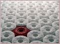
The color of the red lifesaver was a bit of a problem. I had three different "red" lifesavers to choose from. I decided to shoot two different colors and decide between them. Ultimately, I chose the darker of the two. The lighter red one was translucent and the color bled to the white ones around it to the degree that it was distracting. Plus the text was easier to read and the contrast was greater on the dark one. Hence my decision. The only big problem I had was that the lettering on both was far inferior to the crisp clean lettering on the white lifesavers. In the end it was worth having the dark lifesaver in there despite the drawbacks.
As for lighting shortcomings. I got comments that approved and disapproved of the lighting setup (the way the light falls off towards the bottom of the image). If I had given myself an extra day to shoot I would have probably made it so the lighting was even in the front and back, but I did the best I could with what I had. The setup is the same as Keith Maniac's in the Metal challenge. (Thanks Keith Maniac!!!) I basically ripped off his setup, but my lightsource was not directly overhead, hence the uneven lighting.
Anyway, this is way too long. I am just so happy with the outcome. Thanks again for all who commented, and for those who voted.
Matt
Message edited by author 2005-07-13 00:41:27.