| Image |
Comment |
| 10/21/2005 07:33:05 PM |
|
 Photographer found comment helpful. Photographer found comment helpful. |
| 10/19/2005 01:45:22 PM |
|
| Photographer found comment helpful. |
| 09/21/2005 10:26:29 AM |
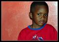
Spiderfanby arsharifComment by okiesisi: Greetings from the Critique Club!!
Good job on a very nice portrait. It is very well composed, the placement of the boy and the angle of his head are very nice. The crop cut off the very top of his head, which is a bit odd. The lighting on the boy could perhaps be a bit softer, and there is a "hot spot" in the upper left corner. The background color does compliment the subject, but the white streaks are just a bit distracting. His face could have been a bit sharper, but is still nicely defined. Overall, the elements seem to accentuate his eyes, which are gorgeous, and seems very deep. Well done and good luck on future challenges!
~SiSi |
| 09/18/2005 11:27:32 PM |
Spiderfanby arsharifComment by Portia_N: This is nice, but I think it would have been better if the top of his head wasn't cut off. |
| 09/17/2005 09:59:55 PM |
Spiderfanby arsharifComment by thomaspeople: I'm pretty sure my little boy has this same shirt. The image is very good. But the background's texture is distracting. I don't have a problem with the red theme. Ithink the colors balance nicely, but the wall has distracting imperfections and the light reflecting in the top right takes away from the beauty of the boy's face. |
| 09/17/2005 12:38:12 PM |
Spiderfanby arsharifComment by AzCKelly: Cute expression! The background is a bit distracting from the subject to me. Love his eyes. |
| 09/17/2005 03:42:19 AM |
Spiderfanby arsharifComment by yanko: I would have just gone with a different title so as to avoid cropping the head. |
| 09/15/2005 06:49:43 PM |
|
| 09/14/2005 05:03:20 AM |
Spiderfanby arsharifComment by pixieland: I feel the background has ruined an otherwise excellent portrait. The color and texture are clashing with the young man's shirt. The flash is bouncing harshly off the wall to his right and casting a little more shadow than needs to be on his right. To avoid unwanted shadows, it's usually best to have your subject several feet away from the background. |
| 09/14/2005 12:56:33 AM |
Spiderfanby arsharifComment by loseme: Nice shot, I have rated a little higher if the clarity was a little sharper. |
Home -
Challenges -
Community -
League -
Photos -
Cameras -
Lenses -
Learn -
Help -
Terms of Use -
Privacy -
Top ^
DPChallenge, and website content and design, Copyright © 2001-2026 Challenging Technologies, LLC.
All digital photo copyrights belong to the photographers and may not be used without permission.
Current Server Time: 05/04/2026 09:16:27 PM EDT.