Family - "Five in the bed and the little one said..."by
notesinstonesComment by e301: from the spare room of the Critique Club
Hi Jennifer
One of the great things about the Critique Club is that you get to meet the work of photographers you perhaps wouldn't have stopped by otherwise. I've been having an interesting little winter's evening stroll around your collections.
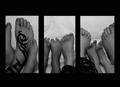
This is an interesting submission for the challenge, I think: I didn't get to vote on this shot, but I do remember feeling rather confised by the whole thing - I think because the central idea of the challenge seemed to demand an approach to photography that I don't really share. In many images I struggled to find a valid reason for the separation of the framing, be it between different images or the same image split up. I'm not completely sure I can see a reason here, but it does have a flow of composition that I like.
A couple of things; I'm not sure about your control of brighness - this shows up in a couple of other shots of your here. This one seems overall quite dull to me - the dynamic range of the shot could be broader - the diswtance betwen the bright and dark points seems narrow here. Of course, one would have to be careful not take things too far and turn the sheet into a blinding white blankness, but there is surely room for more brightness. That would, I think, suit the mood of your image better, also; it's a warm, family kind of feel I think, and some more punch to the image wouldn't hurt, surely?
I also wonder about the size and dimensions of your framing. Given the smallness of the required image anyway (especially as higher and higher resolution screens become more common), I think from a purely practical point of view you've probably used too much frame for the images, which leaves them feeling a touch cramped.
As to the idea - well, I'm not sure I can say much. It doesn't
grab me, as many of the successful images here do, and nor does it particularly engage my brain - I don't find the variety of subject, or of processes in this that would fascinate in a photograph. Mind you, to produce such every week would be an impossibility - but I think it should be the aim, at least. There are sensible choices made here, certainly - framing the smaller feet with the larger works, the range of poses also. The light? Well, it seems a bit too general for this subject, perhaps; especially against a white background. Given the everyday nature of the subject, I would have thought a more sideways shaping light would have been effective, to absolutely make the most of the variety of forms you have.
The composition, overall, may be a bit too static also - the vertical orientation of
all the feet is perhaps a bit too blank, especially given that the heavy framing only emphasises that.
Those are just some immediate thoughts - I am, of course, not representative of the site as a whole, only of my way of looking at things. Hope it's of some use.
Ed