| Image |
Comment |
| 12/06/2004 06:52:01 PM |
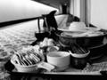
RoomService.jpgby JuneBug28Comment by LindaLee: I like the tonal range of this black and white treatment, but would have preferred to see better dof, specifically having just the background blurred, and having the foreground items quite well focused. |
| 12/06/2004 06:12:01 PM |
RoomService.jpgby JuneBug28Comment by orussell: More DOF would be better in my opinion. Personally, I think shallow DOF should be used, in most cases, to separate your subject from your background (and/or foreground). To me, it seems as though the entire serving tray should be your subject, as nothing on the tray itself stands out, particularly. Maybe if you had taken the shot, a greater distance from the cart, with a less shallow DOF, it would have been more effective. |
| 11/04/2004 04:14:17 PM |
Jenni.jpgby JuneBug28Comment by Donatien: I think you have an excellent shot, but I think it's too red. If you open Hue/Saturation in Photoshop and adjust the red level you can see that it's nearly all red actually.
I adjusted Hue/Saturation (desaturated reds a bit), used Curves on the red channel mainly to try to find a more natural skin-tone and finally some color balance where i pulled the yellow/blue a bit to the yellow. I'm truly no expert on this and it was a quick-fix, but I think I got it to look a bit more natural. I've uploaded it into my portfolio as Janni2. Hope you don't mind - I'll of course remove it soon. |
| 11/04/2004 03:56:28 PM |
Jenni.jpgby JuneBug28Comment by AutumnCat: It's a nice photo.
I agree - the crop is too close for my taste, including the partial ear.
Something about the photo is distracting. It's like it's too "in your face" or personal space when looking at it. Would like to see the color adjusted. Maybe a different/lower angle. Message edited by author 2004-11-04 15:56:53. |
| 11/04/2004 03:50:09 PM |
Jenni.jpgby JuneBug28Comment by jmassung: The thing that bugs me the most about it is the red reflection on the face because of the red shirt. It makes the model look embaressed. The ear is cut off as well. Otherwise it's good. |
| 11/04/2004 03:42:54 PM |
Jenni.jpgby JuneBug28Comment by rscorp: Overall a good shot. Something about it doesn't capture my interest too much but I can't figure out what that is. I think they'll really like it though. Maybe the crop is too close for my own personal taste and for me it would be better to involve a bit more of the hair. Or, to lessen the darkness just above the skin of her face, maybe add a splash of light onto her hair to highlight it a bit and bring that into the photo a little bit. Good job. |
| 11/04/2004 03:42:40 PM |
Jenni.jpgby JuneBug28Comment by claudia26: nice face and smile , relaxed into the camera - but the ear cut off is not working well , seen like this the face feels a bit too close |
| 11/04/2004 03:16:51 PM |
Jenni.jpgby JuneBug28Comment by ianmill: Tightly cropped; nice lighting angle; nice smile and teeth - but it doesn't "grab" me. I'm sure your model will be delighted, though. Any more examples?
Ian |
| 10/19/2004 09:23:22 PM |
|
| 10/16/2004 11:11:41 PM |
Can You Hear Me Now?by JuneBug28Comment by TooCool: What an impossible exposure... I'm sure you've gotten the comments about your blown out background. A different angle between subjects or better yet, shooting during the golden hours (just after dawn or just before sunset) would do wonders for this...
TC |
Home -
Challenges -
Community -
League -
Photos -
Cameras -
Lenses -
Learn -
Help -
Terms of Use -
Privacy -
Top ^
DPChallenge, and website content and design, Copyright © 2001-2026 Challenging Technologies, LLC.
All digital photo copyrights belong to the photographers and may not be used without permission.
Current Server Time: 07/16/2026 06:54:35 AM EDT.