DPChallenge: A Digital Photography Contest You are not logged in. (log in or register
 
Browse Settings
Currently viewing:
Registered UserDmaskeze

Show comments:

Per page:

Order:

Comments:


Comments Received by Dmaskeze
Pages:   ...
Showing 41 - 50 of ~128
Image Comment
The lucky 7
12/02/2004 03:13:52 AM
The lucky 7
by Dmaskeze

Comment by srdanz:
there's too much below the pigeons. Cropping about half of the blue&yellow stripes would;ve made this much better. only a 7 though.
The lucky 7
12/02/2004 12:11:03 AM
The lucky 7
by Dmaskeze

Comment by rscorp:
A shallower dof would have helped this photo in my opinion. With the buildings in the background being so clear, my eyes are drifting towards them and away from your subjects.
The lucky 7
12/01/2004 06:25:24 PM
The lucky 7
by Dmaskeze

Comment by aukipa:
happy birds on the roof! can't get too lucky if you are below it. ;-)
The lucky 7
12/01/2004 03:33:39 PM
The lucky 7
by Dmaskeze

Comment by sblair2146:
You must have waited for some time to get only 7 pigeons.
The lucky 7
12/01/2004 11:40:09 AM
The lucky 7
by Dmaskeze

Comment by BikeRacer:
interesting, but a little busy, wish you had framed it differently.
The Ruler Of All
12/01/2004 10:04:45 AM
The Ruler Of All
by Dmaskeze

Comment by tristalisk:
Greetings from the Critique Club :)

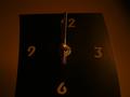
Meeting the challenge: I think this is an excellent theme for the challenge. For time is the final authority.

Lighting: I feel that the lighting hurt this shot pretty badly. It is just to dark. While I see the reason and mood behind the dark and gloomy lighting I feel it was over done. Perhaps a strong light coned down to het smaller towards the top of the clock would have worked realy well. It would given the clock an illusion of being taller. I brighter light also would have brought out more details in the photo.

Composition: I like the way this shot was set up. The clock hands set on midnight. The angle you took this photo from was also excellent. It gave the clock a taller more dominating look. However the overall angle of the shot is a little off. Try rotating the entire photo 1 or 2 degrees to the right.

Technical: Poor lighting. the focus was good from what I can tell. I feel the choosing the center of the clock hands was a good choice for your center of focus.

Artistic opinion: I like this shot from an artistic stand point. Very "message" heavy. Decent balance, and center line. The brighter lighting would likly have given this alot of colors to enjoy.

Overall: this is a shot with a lot of potential. Fix the lighting and this would have been far more interesting a photo. I think your score easily could have been 5.5 or higher with just the better lighting.

keep up the good work

Tristalisk

The lucky 7
12/01/2004 03:36:21 AM
The lucky 7
by Dmaskeze

Comment by Rastas:
the subjects are lost in the background... hmmm flying rodents...
The lucky 7
12/01/2004 12:40:35 AM
The lucky 7
by Dmaskeze

Comment by Dr.Confuser:
This feels a bit over exposed to me. We've lost the sky, and the birds are lost to the background. I wonder if darkening it slightly and boosting the contrast would help?
Photographer found comment helpful.
The Ruler Of All
11/29/2004 10:39:52 PM
The Ruler Of All
by Dmaskeze

Comment by Gatorguy:
Ain't that the truth. As for the photo, I think it's a little on the dark side and the parallax is a little distracting, not too bad though. One suggestion for added interest would be if you placed the hands at something other than the same place. A 7 from me mostly for the message.
The Ruler Of All
11/29/2004 09:20:56 PM
The Ruler Of All
by Dmaskeze

Comment by rkligman:
Too dark. Very bland.
Pages:   ...
Showing 41 - 50 of ~128


Home - Challenges - Community - League - Photos - Cameras - Lenses - Learn - Help - Terms of Use - Privacy - Top ^
DPChallenge, and website content and design, Copyright © 2001-2025 Challenging Technologies, LLC.
All digital photo copyrights belong to the photographers and may not be used without permission.
Current Server Time: 08/23/2025 11:18:03 PM EDT.