| Image |
Comment |
| 09/18/2005 11:25:57 PM |
|
 Photographer found comment helpful. Photographer found comment helpful. |
| 09/18/2005 09:10:47 PM |
|
| Photographer found comment helpful. |
| 09/17/2005 10:36:31 AM |
|
| Photographer found comment helpful. |
| 09/16/2005 07:58:14 PM |
|
| Photographer found comment helpful. |
| 09/16/2005 07:11:05 PM |
|
| 09/16/2005 04:39:53 PM |
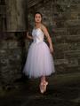
Ballerinaby kiwinickComment by LindaLee: Too much stone wall, not enough ballerina for me. Would have liked to have seen a tighter crop. Lighting looks good though! |
| Photographer found comment helpful. |
| 09/15/2005 10:42:34 PM |
Historic building facadeby kiwinickComment by sanx: The fruit thing is sort of random, and the clouds in the sky are glare-ish and unnaturally white. But I love the lines in this image...and there's just a little bit too much line. |
| Photographer found comment helpful. |
| 09/15/2005 10:10:42 PM |
Ballerinaby kiwinickComment by Tammer: I wonder how this would look if it were cropped in a bit more from the right hand side? This would take the subject out of the center, which for me, makes photos a bit more interesting. I do like how she has a pretty white tutu against the dirty, gritty background. |
| Photographer found comment helpful. |
| 09/15/2005 05:19:51 AM |
Ballerinaby kiwinickComment by Refwhett: The subject is too central. There is too much space around her and I'm not getting a good look at her. I like the idea of a somewhat out of place ballerina. A tighter crop and slightly different composition with hernot in the center would have amde for a very nice image. 5 |
| Photographer found comment helpful. |
| 09/14/2005 01:55:51 PM |
Ballerinaby kiwinickComment by davmct: nice picture, but needs more light brought into the subjects face. i think this shot might be downgraded for not cropping tightly around her face, which isn't necessarily a requirement, but i think for this to be considered a portrait, you need to really highlight the model's face. currently, i think her eyes are too dark and just sink into her face, removing any expression that could have been interpreted. a shame, because the background is lovely, and the model has a lot of potential. I'd try to reshoot this with a light reflector to get some more natural lighting. 5/10 |
| Photographer found comment helpful. |
Home -
Challenges -
Community -
League -
Photos -
Cameras -
Lenses -
Learn -
Help -
Terms of Use -
Privacy -
Top ^
DPChallenge, and website content and design, Copyright © 2001-2026 Challenging Technologies, LLC.
All digital photo copyrights belong to the photographers and may not be used without permission.
Current Server Time: 07/23/2026 01:24:01 PM EDT.