| Image |
Comment |
| 12/09/2009 04:49:26 PM |
|
| 12/07/2009 04:08:13 PM |
Masterchef gourmet judgeby kiwinickComment by DigiFotoBuddy: Food doesn't look appetizing at all, sorry for the low vote. The lighting is the important aspect when taking food shots, which is completely ingnored here. The plate looks gross unless that was the intension. |
 Photographer found comment helpful. Photographer found comment helpful. |
| 12/07/2009 01:34:50 PM |
|
| Photographer found comment helpful. |
| 12/04/2009 12:47:05 PM |
|
| Photographer found comment helpful. |
| 12/04/2009 06:33:00 AM |
Masterchef gourmet judgeby kiwinickComment by acg83: Looks like a very low resolution shot.
Really underexposed on the cake.
Awkward perspective - it's not directly above and it makes the photo look flat.
Awkward crop of the plate and cake.
The idea has potential. I think the gooey filling of the cake would make for an excellent shot if taken from a lower angle and closer in. Some directed lighting would help. |
| 12/03/2009 04:45:09 AM |
Masterchef gourmet judgeby kiwinickComment by paynekj: I think it's the lack of cleanliness that bugs me about this. I also find the point of view off-putting - it feels like looking down and backward. Good idea though. |
| Photographer found comment helpful. |
| 12/03/2009 01:10:12 AM |
Masterchef gourmet judgeby kiwinickComment by HarveyG: You are probably wondering why so few or no comments? All I can say is ugh.
Fork tips are blown, probably by the flash. (Drop it's intensity by at least 2 or 3 stops.) Then get some ambient light or a simple 100w Halogen hand held above to get detail in the dark erm food(?) in the middle. I can't see what that mess is below the utensils and the composition has me turning my head 90 degrees to the right. Change the perspective so that the fork and spoon are left and right as if you were about to eat. Change the angle of view as you would see in most food mags. Sorry just not very inspiring. I don't mean to be harsh. This is my opinion only. Look at your histogram and you will see you have enormous peaks in dark and light areas and little elsewhere. I hope this constructive crit helps. |
| Photographer found comment helpful. |
| 12/02/2009 04:53:23 PM |
|
| 11/30/2009 11:19:43 AM |
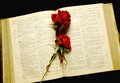
The Message is Loveby kiwinickComment by EL-ROI: It's a great shot, well exposed, nice black background and lovely red color on the rose. It looks like it is suffering from jpg conversion and resize. Unfortunately there is some definite jagged pixelating on the edges of the pages and the text lost some detail. I'll bet the original does not show this. |
| Photographer found comment helpful. |
| 11/29/2009 09:08:33 PM |
|
Home -
Challenges -
Community -
League -
Photos -
Cameras -
Lenses -
Learn -
Help -
Terms of Use -
Privacy -
Top ^
DPChallenge, and website content and design, Copyright © 2001-2026 Challenging Technologies, LLC.
All digital photo copyrights belong to the photographers and may not be used without permission.
Current Server Time: 07/24/2026 02:08:59 AM EDT.