| Image |
Comment |
| 11/03/2005 03:10:27 PM |
Flower Powerby SteveJComment by Neil: I agree with Ursula that this scored way too low. It's a nice image, good movement abstraction. I would however, have preferred it without most of the stem--a crop of the left portion just above the leaf. The danger of that is that it does appear to be "severed" and "floating", but I find the blur effect on the stem, especially the leaf, more a distraction than anything else. Worth playing with some crops. Don't let the DPC voters discourage you from experimenting like this! |
 Photographer found comment helpful. Photographer found comment helpful. |
| 11/02/2005 12:39:32 AM |
Flower Powerby SteveJComment by ursula: I had to come back to this image. First of all, the score is way too low (in my opinion) for the quality and execution of the image. It is very difficult to "get a high score" with this kind of image.
What I am wondering though, why did you choose a movement image, why did you choose this movement image? It is the kind of image that grows on you: the more I look at it, the more I like it. Contrary to what I said before, the movement does add to this image, it makes the image. But why?
I am so very much trying to understand camera movement pictures. They are so very attractive, but I don't understand the purpose or meaning of them for the most part - usually they seem to me like a picture with movement but why?
Oh well. It's late.
|
| Photographer found comment helpful. |
| 11/01/2005 11:54:21 PM |
Flower Powerby SteveJComment by ursula: Nice execution - colours, white background, composition, clean movement, everything is fine, but, IMHO, the movement doesn't really add anything to this picture, why? |
| Photographer found comment helpful. |
| 10/29/2005 02:34:11 PM |
|
| Photographer found comment helpful. |
| 10/28/2005 02:20:51 PM |
|
| Photographer found comment helpful. |
| 10/27/2005 09:29:43 AM |
Flower Powerby SteveJComment by digitalknight: the image is much more profound than the title gives it credit for - I really like this, but I'm sure many many voters don't. It just makes it art - something this site doesn't really reward. Do a whole series of flowers like this, frame them and sell them as sets.
I'd personally crop the white space off of the right hand side so the space between the blossom and the right edge is the same as the space between the stem and the left edge.
8 |
| Photographer found comment helpful. |
| 10/27/2005 02:07:18 AM |
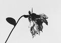
Its Time Has Passedby SteveJComment by fotodude: very nice framing and composition....i just don't understand why there blaks in this image are so washed out...the apear a foggy gray/black color....if only they had a very deep tone to them...a true black...man this image would be in my favs. as it is i think u came really close but need to mess with curves to have the full impact this shot could bring |
| Photographer found comment helpful. |
| 10/26/2005 11:26:28 PM |
|
| Photographer found comment helpful. |
| 10/26/2005 08:50:23 PM |
Flower Powerby SteveJComment by AzCKelly: Interesting abstract and title. Love the orange/red color of the bloom and the way the flower enters the frame. |
| Photographer found comment helpful. |
| 10/26/2005 06:42:38 PM |
Flower Powerby SteveJComment by kari1: I had a hard time looking at this picture, I know this is meant to be out of focus ... but it hints at dizzy not delicate. |
| Photographer found comment helpful. |
Home -
Challenges -
Community -
League -
Photos -
Cameras -
Lenses -
Learn -
Help -
Terms of Use -
Privacy -
Top ^
DPChallenge, and website content and design, Copyright © 2001-2026 Challenging Technologies, LLC.
All digital photo copyrights belong to the photographers and may not be used without permission.
Current Server Time: 07/17/2026 01:39:17 AM EDT.