|
|
| Image |
Comment |
| 12/30/2005 07:52:05 AM | |  Photographer found comment helpful. Photographer found comment helpful. |
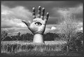
| 12/27/2005 11:28:31 AM | Rite of Passageby quark314Comment by quark314: Originally posted by hbunch7187:
*Critique Club*
I think this is an excellent idea and hits the challenge perfectly. The only real problem for me, is that it's just not a visually appealing photo. Technically, I think it's well done. Good focus and clarity. We get nice details in the words and we get to see the humor in the shot.
Lighting is good, there are no horrible hot spots or distracting shadows. I think that's really important because of the words, if you get bad lighting, all the words would be unreadable and this shot wouldn't have as much humor value.
I do think it's a bit crowded. I think one of the pencils and the other 1040 form on the right could be removed without hurting the photo. It just seems like too many items crammed into the photo and feels very set up. TOO set up. Of course, I'd have to actually SEE it without the pencil and paper to determine if it looks better that way, or if it then seems to be missing something, but definately it seems like it's too forced.
Overall, it's technically good and a great idea, just lacking some visual punch.
~Heather~ |
Thanks for the critique, Heather. I appreciate the time you spent analyzing and commenting and I welcome all who are interested in providing useful, constructive (positive or negative) feedback, to comment on or provide an in-depth critique of any of my work, either openly or via PM.
It's a given that a good photograph speaks for itself with little or no additional "explanation" necessary. However, by way of going a little deeper than the immediate, superficial layer of understanding, I submit the following thoughts for the viewers' consideration (quoting, in part, from the critique, above):
I do think it's a bit crowded.
It's crowded to reflect the "crowded', busy life of an adult.
I think one of the pencils and the other 1040 form on the right could be removed without hurting the photo. It just seems like too many items crammed into the photo...
There are two pencils because one is broken (as a result of stress and tension - the guy's on tranqulizers for a reason! LOL! BTW, the presription label is totally home made & put onto an allergy pill vial). It's not at all uncommon to have a spare pencil handy. If one looks closely, they see that the "other 1040" is actually the sample sheet (part of the instructions). The instructions are included because they are frequently more of a source of anxiety and irritation than a help. As for "too many items crammed in...", there are plenty of people who have to literally clear off just the corner of a table or desk to make room to perform a task like writing a letter or filling out a form because their kids or spouse have the rest of the space occupied with their own "projects".
Of course, I'd have to actually SEE it without the pencil and paper to determine if it looks better that way, or if it then seems to be missing something, but definately it seems like it's too forced.
Overall, it's technically good and a great idea, just lacking some visual punch.
I did see it without these elements (pencil & paper) in several of the out-takes leading up to the final version. It did not convey the sense of crowding that I was after (and thankfully, achieved). I made the lighting as flat and "boring" as I could - while, at the same time, trying to hold detail - again in reference to the boring, routine nature of so many aspects of adult life.
Thank you (and everyone else), again, for your comments. I wish everyone at DPC a happy, healthy, prosperous New Year! God Bless!
|
| 12/18/2005 11:04:06 PM | Rite of Passageby quark314Comment by quark314: Originally posted by blindjustice:
The IRs gets mad when you fill it out in pencil; Lacks some duende/ perhaps a less cluttered shot would improve the compostiion. |
That's OK - I get mad at the IRS for myriad reasons (none of them involving pencils, per se (pencil necks, maybe - but that's another story ;) )
Here's some duende for ya - "The first thing we do, let's kill all the lawyers". - (W. Shakespeare, "Henry VI", Act IV, Scene II)
Lastly, yer band needs more cowbell! :))
Just funnin' ya! :)) |
| 12/18/2005 10:02:23 PM | | | Photographer found comment helpful. |
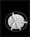
| 12/16/2005 11:19:23 PM | Just Another Peace of Cheeseby quark314Comment by sarrobi: Great idea. Beautifully executed. I love the austerity of this composition. The only thing that bothers me is the smudge or reflection to just next to the right-hand piece of cheese. | | Photographer found comment helpful. |
| 12/16/2005 02:04:34 PM | |
| 12/16/2005 08:10:06 AM | Rite of Passageby quark314Comment by blindjustice: The IRs gets mad when you fill it out in pencil; Lacks some duende/ perhaps a less cluttered shot would improve the compostiion. |
| 12/15/2005 09:17:39 PM | | | Photographer found comment helpful. |
| 12/15/2005 08:59:00 AM | | | Photographer found comment helpful. |
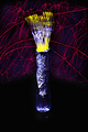
| 12/15/2005 08:52:27 AM | Atomic Fork Boquetby quark314Comment by mandyturner: *Critique Club*
Interesting choice for the challenge. It is different from anything else and I think that is a plus. I always love to see something orginal other than predictable.
Quality of Photo: Not sure what the orginal looked like but your dodge and burning strokes are visible on my computer. To me that is a big no-no. Dodging can be a great tool, but you DON'T want viewers to be able to tell you used it by seeing the stroke marks. The photo would have been better with more focus on the main subject..forks. The yellow light coming from the vase looks oversaturated.
Appeal: Photos are not loved by everyone. You will find some viewers to love your work and some that do not see your vision. I find this photo very distracting. There is so much going on, I don't even know where to look first. The red lazor light lines are just everywhere, maybe if they were only shooting out of the vase, it would have been better. The yellow light coming from the vase is a great idea...I feel that it is just too bright. Not sure why you used the foil....really doesn't add to the image, IMO.
Challenge: You met the challenge, not only with something orginal but with a lot of creativity. Overall, I think this is a great idea using the lights to add interest, I just would have experiemented with different looks to get a more appealing photograph....something that looks a little more put together and organized.
I hope this was helpful and isn't too harsh. I try to be honest about what I see. I am by no means perfect or claim to be...I have come up with some images 10 times worse than this. Just look at my portfolio.
Good luck in future challenges.
mandy |
Home -
Challenges -
Community -
League -
Photos -
Cameras -
Lenses -
Learn -
Help -
Terms of Use -
Privacy -
Top ^
DPChallenge, and website content and design, Copyright © 2001-2026 Challenging Technologies, LLC.
All digital photo copyrights belong to the photographers and may not be used without permission.
Current Server Time: 07/15/2026 04:32:37 PM EDT.
|