| Image |
Comment |
| 09/14/2005 09:14:49 PM |
|
| 09/14/2005 08:06:36 PM |
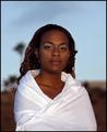
Peaceby RudyC310Comment by Qart: great mood and subject... a little more light on the subjects face would have helped for me as the features seem a little lost less defined than I would like... well done... :) |
| 09/14/2005 01:46:15 PM |
Peaceby RudyC310Comment by davmct: a bit soft in the face but a very nice shot. excellent lighting and composition. nice warm colour. wish model was repositioned to block out-of-focus tree to the left. probably would crop a little bit from the top. 7/10 |
| 09/14/2005 05:55:34 AM |
Peaceby RudyC310Comment by pixieland: Great eye contact and expression. Love the wrap. I think it would have been absolutely beautiful if you had moved in closer filling up the frame with her and catching a bit more light in her eyes and on her face. 8 |
| 09/14/2005 12:08:31 AM |
|
| 09/13/2005 11:13:35 PM |
Peaceby RudyC310Comment by jenesis: Very Very pretty! I love your use of natural sunlight. Looks like the perfect time of day with nice warm light. She fits in nicely with the scene. It has a very exotic feel to it. Good job on using the white coverup and being able to keep the details while keeping it bright but not blownout. What I might do if this were mine would be to maybe dodge the eyes a slight bit to make them stand out a little more and maybe try to brighten her face just a bit more. But overall, I think this is a very nice portrait. Well Done |
| 09/13/2005 08:36:56 PM |
Peaceby RudyC310Comment by downtherabbithole: wow, I love the statement this pose makes! it's almost like a freedom meets future ceo of america feeling. The only problem with th epose is the hair, it's very fuzzy and hangs across the left shoulder but other than that I like it. The makeup around the eyes doesn't really seem to match the face either. I like the use of dof and the emotion in her eyes. great shot |
| 09/13/2005 10:31:05 AM |
Peaceby RudyC310Comment by Faye Pekas: Beautiful model. I think there is too much space above her. Also maybe more light on her face would have worked better. |
| 09/13/2005 10:04:57 AM |
Peaceby RudyC310Comment by VanGogh: I like this, too bad you didn't have some dramatic lighting on her face. |
| 09/12/2005 05:08:45 PM |
Peaceby RudyC310Comment by madison461: The lighting is too harsh and the background distracting. It looks like the brown things on the left are growing off her head. The horizon cuts the photo in half. |
Home -
Challenges -
Community -
League -
Photos -
Cameras -
Lenses -
Learn -
Help -
Terms of Use -
Privacy -
Top ^
DPChallenge, and website content and design, Copyright © 2001-2026 Challenging Technologies, LLC.
All digital photo copyrights belong to the photographers and may not be used without permission.
Current Server Time: 07/24/2026 02:09:59 AM EDT.