| Image |
Comment |
| 05/03/2006 10:11:44 AM |
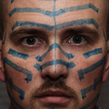
'Til I'm Blue in the Faceby nards656Comment by eschelar: It's a pretty clear portrait, but I'm having trouble with linking it to the meaning of the saying *doing something* until you are blue in the face... The portrait is too restive for me to link with this saying. The face is not nearly blue enough either. |
 Photographer found comment helpful. Photographer found comment helpful. |
| 05/03/2006 07:48:35 AM |
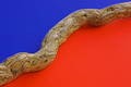
Divisionby nards656Comment by nards656: It's supposed to be blue and orange; apparently the monitor issue really got me. Karma and I both thought that it wasn't orange enough so I hue shifted a bit, and several people thought it too red. I really appreciate all the feedback on that, because I have a nearly "impossible to calibrate" cheap flatscreen, and I need to know all I can about what others see. Thanks. |
| 05/03/2006 06:44:49 AM |
Divisionby nards656Comment by timfythetoo: I gave a 6 on this one. I liked the minimalist approach but would have preffered a bit more clarity on the wood. I figure the letters on the blue side were not intentional and if in advanced editing they would be gone. Overall it was a good shot. Good colors and the angle works well. Lack of "Wow" factor hurt it. Now if you had a chameleon walking on that log...
(quick read of lower comments - I do see cc with blue and orange) |
| Photographer found comment helpful. |
| 05/03/2006 01:48:21 AM |
Divisionby nards656Comment by ericwoo: --Trading Post Comment--
I really can't see the blur, but I think that you suffered from not choosing complementary colors. Red's complement is green and blue's is orange. Either way, I like this iamge. The composition is nicely balanced and the wodd in the middle really works well to draw the eye up and through the image. My only ding in voting was the colors. Still, very nice work. |
| Photographer found comment helpful. |
| 05/02/2006 05:19:11 PM |
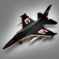
Seniorby nards656Comment by ericwoo: I though her was a NASCAR dirver. Very neat capture. The lighting and the exposure are near flawless. I am not normalyl a big fan of product photography, but this one works well. Too bad little E blew his engine MOnday, huh? NIce work. |
| Photographer found comment helpful. |
| 05/02/2006 04:12:21 PM |
|
| Photographer found comment helpful. |
| 05/02/2006 02:04:21 PM |
|
| Photographer found comment helpful. |
| 05/01/2006 10:55:47 PM |
Seniorby nards656Comment by C_Steve_G: I don't see a connection; one would never equate a stock car to a jet, but it's a pretty good image. I can see banding artifacts in the background, which makes the image look too processed. The way to avoid it is to minimize levels/curves adjustments, which tend to emphasize these bands, especially in grays & blues. |
| Photographer found comment helpful. |
| 05/01/2006 06:33:39 PM |
|
| Photographer found comment helpful. |
| 05/01/2006 12:28:26 AM |
Divisionby nards656Comment by karmat: i know this picture. . .
I think it is cool, but I'm not voting on it . :) |
| Photographer found comment helpful. |
Home -
Challenges -
Community -
League -
Photos -
Cameras -
Lenses -
Learn -
Help -
Terms of Use -
Privacy -
Top ^
DPChallenge, and website content and design, Copyright © 2001-2026 Challenging Technologies, LLC.
All digital photo copyrights belong to the photographers and may not be used without permission.
Current Server Time: 07/18/2026 01:47:32 AM EDT.