| Image |
Comment |
| 05/04/2006 09:28:27 AM |
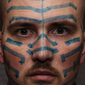
'Til I'm Blue in the Faceby nards656Comment by GoodEnd: Good idea! One more light source will have helped you a lot. Try to use multiple light sources to improve portraits giving you less contrast and more appealing images. |
 Photographer found comment helpful. Photographer found comment helpful. |
| 05/03/2006 09:53:44 PM |
|
| Photographer found comment helpful. |
| 05/03/2006 09:50:33 PM |
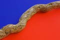
Divisionby nards656Comment by Melethia: Trading Post comment
Nice score, and an addition to your top row on your profile page, no less! It's bold, bright, simple and has a nice strong diagonal. I don't really notice the blurriness you mention all that much; the texture of the wood is nice against the smoothness of the color and I suppose a bit more sharpening might have helped. I suspect it would have done better had the orange been more "orange" - it looks a little reddish on my monitor. |
| Photographer found comment helpful. |
| 05/03/2006 08:14:45 PM |
Divisionby nards656Comment by DanSig: [[Trading Post]]
this is a very nice abstract, but there's something that makes it uncomfortable to look at.
the proportion of red and blue are too even, there should be about 65% blue and 35% red, as red is the dominant color and takes all the attention away from the blue, using different amount of color gives more balance to the image.
and while using those proportions it gives you the chance of spliting the image to fulfil the rule of thirds.
that twig gives the image a nice feeling, makes it more alive than using something without texture to split the colors.
keep playing with colors, it really helps you being a better photographer. |
| Photographer found comment helpful. |
| 05/03/2006 07:09:23 PM |
Divisionby nards656Comment by sherpet: I love this composition so very much.....I too got so many comments that my image looked red not orange so feel for you. I do believe this should have got a much higher position..... I love it so it is now in my favorites as well..... |
| Photographer found comment helpful. |
| 05/03/2006 05:44:17 PM |
Divisionby nards656Comment by tngrndream: hello,
my whole problem with this one is that on my screen it almost looks red instead of orange. i almost wrote a not with this one that said dnmc.
i looked a bit more becuase i simply could not believe that this composition would not be right and thinking the "red" was a bit off, realized it was off because it wasnt red. lol.
i think ifn that orange were more orange, and it was a bit sharper you would have been much much higher. |
| Photographer found comment helpful. |
| 05/03/2006 04:20:51 PM |
Divisionby nards656Comment by kirsty_mcn: ITs a nice simple idea, and I didnt even notice the red/blue thing for ages*, but the stick used as the division is a bit..well, ..boring imho. I would like to see the same idea but with something more dynamic - I'm sure I'm seen a similar design (albeit achieved in PS) with a lizard, that was used for some logo or something.
The scratches on the blue b/g detract, guess they could easily be removed outside of basic editing. The idea is simple and cool but needs something extra for that 'wow'
Hope you're feeling better anyway :)
*Yes, its very much red to me, but then again, my monitor isn't greatly calibrated itself |
| Photographer found comment helpful. |
| 05/03/2006 02:59:27 PM |
Divisionby nards656Comment by Louis: I know you've heard it already, but it really looks like red and blue. I would have gone for a pristine look on the blue portion (I think I see scratches on that surface, maybe from where you were positioning the wood). Focus is a little soft, even with USM. At lower left, I think I see a hard line of shadow beneath the wood, which kind of detracts for me. It's an interesting composition nonetheless. |
| Photographer found comment helpful. |
| 05/03/2006 12:47:25 PM |
Divisionby nards656Comment by Kelli: Trading post...
This is a nice image, very simple yet elegant. The wood seems to be off a little and it could be my monitor, but the colors look like red and blue to me. |
| Photographer found comment helpful. |
| 05/03/2006 12:23:56 PM |
|
| Photographer found comment helpful. |
Home -
Challenges -
Community -
League -
Photos -
Cameras -
Lenses -
Learn -
Help -
Terms of Use -
Privacy -
Top ^
DPChallenge, and website content and design, Copyright © 2001-2026 Challenging Technologies, LLC.
All digital photo copyrights belong to the photographers and may not be used without permission.
Current Server Time: 07/17/2026 05:41:40 PM EDT.