| Image |
Comment |
| 05/10/2006 09:57:35 PM |
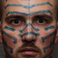
'Til I'm Blue in the Faceby nards656Comment by timfythetoo: Trading Post -
Not quite sure about this one. I think you should have fully committed to the title and went all blue baby. I may have opted for a slightly tighter crop - taken the ears right out. Your lines on the nose are a little off which left the pic seeming a bit off balance. The lines on each side of your face seem symmetrical though. I think the lighting on your eyes was maybe in the middle of where it would have worked better. A little brighter to see the color and detail of your pupils or a littl edarker to make it more sinister.
This shot did make me smile when I first saw it - but you would have scored much higher in my book had you just dipped your whole head in blue paint. That would have screamed dedication to your craft. |
 Photographer found comment helpful. Photographer found comment helpful. |
| 05/10/2006 09:55:58 PM |
'Til I'm Blue in the Faceby nards656Comment by Cam: Its a very good portrait.
My first thought was, if you are going that far, why not go all the way, and do the whole face? I would have left the chin in on the crop.
Not bad at all though. If I voted on the contest....6 or maybe 7. but it had so much potential. |
| Photographer found comment helpful. |
| 05/10/2006 09:20:52 PM |
'Til I'm Blue in the Faceby nards656Comment by Melethia: Trading Post comment
I didn't vote in this challenge, but when I scrolled through, this one made me laugh. Great idea! Need a bit more light to define the eyes and it would have been more effective with more blue. :-) Good job with the skin tones, and I like the crop! |
| Photographer found comment helpful. |
| 05/10/2006 09:39:35 AM |
'Til I'm Blue in the Faceby nards656Comment by Kelli: Trading post...
I gave this a 7. I think the image went well with the saying. The stare is really disconcerting. I think what might have gotten you a better score is if instead of drawing a pattern you made the whole face blue. I like the tight crop around the ears but would have included the rest of the forehead and chin. |
| Photographer found comment helpful. |
| 05/10/2006 04:41:58 AM |
'Til I'm Blue in the Faceby nards656Comment by chalice: I don't know what to make of this photo. I like the tight crop and agree with those who think that the eyes should have been better featured (I've done the same thing, so now I recognize it.) The blue is a bit jarring, but I suppose that is the point. As rhythm goes, the pattern is all drums to me. : ) |
| Photographer found comment helpful. |
| 05/10/2006 01:55:35 AM |
'Til I'm Blue in the Faceby nards656Comment by TechnoShroom: Not a lot of people liked this image. I think the pattern of markings was a little distracting. Interesting idea though. I would have rated higher if focus was back further so that the eyes were sharp as well. Some additional lighting on the eyes would also be nice or you could go the other route and rake the light so it darkens the eyes. |
| Photographer found comment helpful. |
| 05/09/2006 11:18:31 PM |
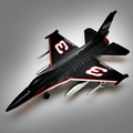
Seniorby nards656Comment by tngrndream: hello again,
i actually liked the photography on this one. the angle and shadows underneath add to it. i like the halo you got goin on as well to isolate the bg.
i just dont think it is much more than a pic of a plane though. great shot of a plane.
|
| Photographer found comment helpful. |
| 05/09/2006 11:45:51 AM |
Seniorby nards656Comment by kirsty_mcn: ~trading post~
Good lighting, but in the end its just 'a picture of a toy' to me (sorry!)
I find it hard to know what to suggest, because you've got the technicalities right, good focus, expoosure, clean backdrop... but it doesn't really 'say' anything. |
| Photographer found comment helpful. |
| 05/08/2006 10:28:48 PM |
Seniorby nards656Comment by Louis: Overall, a very attractive image with excellent lighting, though the subject would not have suffered from being even more lit. Technically, this is a good photo, with nice composition and interesting highlights. I think though that it is banal; technically good photos must also have an interesting and engaging subject (and I know this because I'm the king of technically acceptable and otherwise meaningless photographs). I really would have liked this to have done better, though, because I think it really deserves it. |
| Photographer found comment helpful. |
| 05/08/2006 08:38:04 PM |
Seniorby nards656Comment by Melethia: Trading Post comment
While it's only an "average" subject, the lighting here is great! You've done an excellent job lighting the subject, maintaining excellent detail which is even more impressive given the object is black and chrome, and even creating a "texture" to the light beneath the subject. I suspect the not-so-great score is based on limited appeal of the subject matter. What you've done with the lighting, though, can be transferred to lots of other shots, and that's a very good thing! |
| Photographer found comment helpful. |
Home -
Challenges -
Community -
League -
Photos -
Cameras -
Lenses -
Learn -
Help -
Terms of Use -
Privacy -
Top ^
DPChallenge, and website content and design, Copyright © 2001-2026 Challenging Technologies, LLC.
All digital photo copyrights belong to the photographers and may not be used without permission.
Current Server Time: 07/17/2026 11:06:43 AM EDT.