| Image |
Comment |
| 07/24/2008 11:46:46 PM |
|
 Photographer found comment helpful. Photographer found comment helpful. |
| 07/23/2008 08:22:53 PM |
|
| Photographer found comment helpful. |
| 07/23/2008 07:49:04 PM |
|
| Photographer found comment helpful. |
| 07/23/2008 06:44:15 PM |
|
| Photographer found comment helpful. |
| 07/23/2008 02:55:54 AM |
|
| Photographer found comment helpful. |
| 07/23/2008 12:06:18 AM |
|
| Photographer found comment helpful. |
| 07/18/2008 07:10:52 AM |
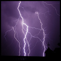
Risk Reward Successby DarkRiderComment by PHOTOKID: I am a sucker for lightning photos, this is very nicely done. You did well with the editing especially with the fact that it was a basic editing challenge. Now that it is over may I suggest a bit of cloning here and there to clean up the stray pieces of the lightning that doesnt really connect to things. I think it would make this more powerful.
You do have a few pieces of sensor dust in the image as well that you could clone to make it a more powerful image. A different crop would have also helped this image a bit, there is to much of the black at the bottom when adding the black frame to it. I would suggest allowing the piece with the weathervane to sit atop your boarder as to give the apprearence of the level horizon being the roof, but still have the weathervane in the photo as it adds interest and a connection to just how close the lightning was.
The last thing I would suggest would be a slight adjustment in the curves perhaps, try to make the clouds a bit darker to perhaps dround out a bit of the very underexposed lightning that barely shows up in the upper left that may distract a bit. Remember the eye wants to go to the brighter objects. |
| Photographer found comment helpful. |
| 07/18/2008 06:59:37 AM |
Marv Jr. "That there is one damn fine coat you're wearin'"by DarkRiderComment by PHOTOKID: There is alot to talk about in this shot. You have a very good tonal range from the shadows on the hands to the higher key areas near the face and shoulder. It (IMO) adds alot of interest when there is that amount of contrasts in the photo.
The composition is good. The postioning of the hands on the vertical 3rds and having the head tilted/arched so as not to feel centered and flat really adds a preception of depth to the photo.
I do feel you may have been hurt in the challenge like you said by the overexposed upper right area, and may have scored a bit better with a bit more control of the lighting. However, I do really like the processing that you have done with the photo, and the skin and pores of the face really pop in this shot.
Just a side note for if you try a similar shot again, I would also take off the ring on your right hand as it interupts the flow up the arms to the face (again IMO) and maybe try with a bit of the actual arm within the photo to also try to give depth. |
| Photographer found comment helpful. |
| 07/01/2008 10:59:53 PM |
|
| Photographer found comment helpful. |
| 07/01/2008 09:46:20 PM |
|
| Photographer found comment helpful. |
Home -
Challenges -
Community -
League -
Photos -
Cameras -
Lenses -
Learn -
Help -
Terms of Use -
Privacy -
Top ^
DPChallenge, and website content and design, Copyright © 2001-2026 Challenging Technologies, LLC.
All digital photo copyrights belong to the photographers and may not be used without permission.
Current Server Time: 07/16/2026 03:06:38 AM EDT.