| Image |
Comment |
| 03/07/2005 12:43:57 PM |
Oak Tree in Snowby visaksenComment by charliebaker: The sky is the missing piece in this photo in my newbie estimation. Clouds would have given this photo the push to the realm of wonder. Still, I love the contrasting blacks/whites of this tree in snow. Beautiful work! |
 Photographer found comment helpful. Photographer found comment helpful. |
| 03/04/2005 10:47:42 PM |
|
| Photographer found comment helpful. |
| 02/28/2005 09:14:41 PM |
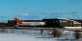
727 communication - www.727.dk (an alternative billboard)by visaksenComment by Skip: ok, i am voting this challenge in 2 passes. in this pass, you will get a partial comment and a score. then i will come back to comment again. if you have any problem whatsoever with this comment, pm me and let me know. otherwise, take it with a grain of salt...i'm not trying to be a know-it-all, i'm just explaining where i'm coming from in voting this challenge. and, if this comment is NOT helpful (of if you think i'm full of $#!+), don't mark it helpful.
billboards are a science unto themselves. a lot of research has gone into determining just how much information a person can digest and retain in specific time spans. they use this information to develop formulas for determining the number of words and letters to use on billboards, as well as their sizes. they also determine the size and number of visual elements to include.
the graphics/photograph on a billboard are designed to get the point across in a moment. on the road, a driver will have less time with a billboard than a voter will give your image. this is a key element in the challenge: composing a shot that will get its point across quickly and succintly. along those lines, a strong composition will probably have few details and make strong use of negative space.
---------------------
i guess you've already been beaten up by the 'you misinterpreted the challenge' gang, so i won't pile on. just don't be afraid to ask in the forums if you aren't sure as to what the description means. don't let this deter your future efforts. better luck next time! |
| Photographer found comment helpful. |
| 02/05/2005 05:04:53 PM |
|
| Photographer found comment helpful. |
| 02/03/2005 03:50:50 AM |
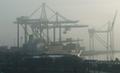
3 lamps in a narrow portby visaksenComment by RedOak: This had the potential of a great picture, but unfortunatly, the colours are weak, its missing some saturation to bring the beige to life. Also there is too much grain on the shot due to shadoes. Also, i dont like the fact that the picture is not leveled. If those balls are in fact lamps, it wouldve made for a great night shot with lighting. |
| Photographer found comment helpful. |
| 01/30/2005 10:15:43 AM |
3 lamps in a narrow portby visaksenComment by dsa157: This had great potential - an interesting point of view, an abstract nature to the subject matter and interesting lighting. Focus seems a bit soft and tones are a bit flat though. |
| Photographer found comment helpful. |
| 01/29/2005 08:33:55 PM |
|
| Photographer found comment helpful. |
| 01/28/2005 08:02:54 PM |
3 lamps in a narrow portby visaksenComment by Falc: I wondered about this one. Almost like a scene from star wars. Then I realised what it actually is. Excellent, not many people look up ;-)
Great work - 7 (there arn't many getting above 7 from me in this challenge!) |
| Photographer found comment helpful. |
| 01/28/2005 05:05:49 PM |
|
| 01/28/2005 12:33:35 PM |
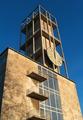
Aarhus town hall and its tower (designed by Arne Jacobsen, 1942)by visaksenComment by Mary Ann Melton: Critique Club
I really like the beautiful stone used in the construction of this tower. I also like the use of color in this photo, because the blue sky makes a dramatic background and contrast which enhances the color of the stone. You had a wonderful sky to work with - great blue.
In terms of composition, I think I would have cropped so that all of the balcony at the bottom was visible rather than "chopped off'. I think I also would have either included more of the left side of the building or cropped all of it out. I think in the original shoot, I would have shot this at several camera angles - one where the right side of the building was squared with the frame, one where the windows were squared (which would still give you the perspective of the lines converging as they get higher), and perhaps one from further away to give a better sense of the height of the tower. |
| Photographer found comment helpful. |
Home -
Challenges -
Community -
League -
Photos -
Cameras -
Lenses -
Learn -
Help -
Terms of Use -
Privacy -
Top ^
DPChallenge, and website content and design, Copyright © 2001-2026 Challenging Technologies, LLC.
All digital photo copyrights belong to the photographers and may not be used without permission.
Current Server Time: 07/16/2026 06:53:48 AM EDT.