| Image |
Comment |
| 12/07/2004 04:00:57 PM |
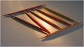
7 ... or 8 ?by sgauriaComment by gloda: Now this one's got the controversy I like. Reminds me of what I like to do. A great idea, but I think the setup's not so good. The reflection is too strong, the angle too flat, the tip of the lower stick is out of focus. I do like the textures of the paper and the sticks. |
| 12/07/2004 07:27:25 AM |
|
| 12/06/2004 08:41:53 PM |
7 ... or 8 ?by sgauriaComment by bananashay: Nice creativity. The glare is unfortunate, it detracts from an picture with a lot of potential and good, interesting composition. More evenly spread lighting and I'd vote this higher. |
| 12/06/2004 10:00:12 AM |
7 ... or 8 ?by sgauriaComment by whagerbaumer: Nice lighting, nice idea, nice toothpicks, nice focus, well framed, good point of view. Yet something very important is missing |
| 12/05/2004 01:49:43 PM |
|
| 12/04/2004 03:59:12 PM |
|
| 12/04/2004 06:33:47 AM |
|
| 12/03/2004 08:16:56 PM |
7 ... or 8 ?by sgauriaComment by Refocused: Very interesting and creative. Thought provoking. Lighting is interesting also. Wish your DOF caught that front toothpick in focus. |
| 12/03/2004 07:42:27 PM |
7 ... or 8 ?by sgauriaComment by arngrimur: Very clever thinking. I like the colour of the toothpicks. I would suggest more space at the top and to the left. |
| 12/02/2004 03:44:17 PM |
|
Home -
Challenges -
Community -
League -
Photos -
Cameras -
Lenses -
Learn -
Help -
Terms of Use -
Privacy -
Top ^
DPChallenge, and website content and design, Copyright © 2001-2026 Challenging Technologies, LLC.
All digital photo copyrights belong to the photographers and may not be used without permission.
Current Server Time: 07/17/2026 06:51:35 PM EDT.