| Image |
Comment |
| 07/15/2002 09:28:00 PM |
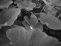
Untitledby prodigal havocComment by karen_v: Very nice! How do you get your water to shine? I tried this on a shot and it didn't bead up OR shine like this. karen_v |
| 07/15/2002 08:42:00 PM |
Untitledby prodigal havocComment by KarenB: The water looks silver in this photo! I like this. I just wish the leaf in the foreground wasn't so prominent. I keep wanting to push it out of my way! ;0) |
| 07/15/2002 05:02:00 PM |
Untitledby prodigal havocComment by mpmcgeehan: Interesting why you chose to remove the color from this photo. It seems to me that it would have worked much better in color. |
| 07/15/2002 04:09:00 PM |
|
| 07/15/2002 02:13:00 PM |
|
| 07/15/2002 02:01:00 PM |
|
| 07/15/2002 01:51:00 PM |
Untitledby prodigal havocComment by Swashbuckler: This is sooo nice. I love these water cupped shots. I would have been tempted to center on one leaf, but this is a really nice view. Color looked bad? (I really like color...) 8 Swash |
| 07/15/2002 12:51:00 PM |
|
| 07/15/2002 11:20:00 AM |
|
| 07/15/2002 04:41:00 AM |
Untitledby prodigal havocComment by justine: Pretty nice shot. I do think the composition could of been improved. The leaf in the front is the least interesting. Your tones are okay I just would of liked them a bit lighter or with more contrast. Over all I like this shot. Kee |
Home -
Challenges -
Community -
League -
Photos -
Cameras -
Lenses -
Learn -
Help -
Terms of Use -
Privacy -
Top ^
DPChallenge, and website content and design, Copyright © 2001-2026 Challenging Technologies, LLC.
All digital photo copyrights belong to the photographers and may not be used without permission.
Current Server Time: 07/09/2026 06:03:11 PM EDT.