| Image |
Comment |
| 06/06/2006 05:15:31 PM |
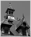
19th Centuryby rayg544Comment by LeeD: Hello from the Critique Club
Initial Impression
A very nice image, but the border really takes away from the image
Detailed Critique
Technically I think this is a wonderful image. There is a lot of texture and visual interest in this particular image and the composition is spot on. The choice of black and white works very well for this image and adds a nice warm "rustic" appeal to the shot. I would be interested to see how you did your B&W conversion. It seems like you probably could've used the channel mixer to give it more depth and a wider range of tones. As it is it seems a little "flat", but that could be a product of the harsh midday lighting also. For me, the border does not work at all, but I've never really been a fan of gradient borders. If you MUST use a border, I think a simpler solid black border with a very thin light gray inset would work better for this particular shot.
Overall Impression
I really like the shot, with some more tweaking in post-processing, you could take this image to a new level. I for one would definitely would lose the border, but that's just a matter of personal taste.
Great shot... Keep shooting! |
 Photographer found comment helpful. Photographer found comment helpful. |
| 06/05/2006 02:51:05 PM |
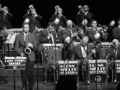
On Top of "Swing"by rayg544Comment by ericwoo: Hey there from the Critique Club
Camera Work/Technical: Very nice exposure, and a great depth of field, ensuring that all levels of the band were in crisp focus. Something, however, is making this one a bit pixelated. I am not sure if it was the conversion or some neat image, but my eye is seeing something that is a bit distracting.
Lighting: Very nice and a very strong element of this image. There are no harsh shadows or blown out highlights. This is a terrifically lit capture in an area that I imagine had lighting that was difficult to work with. Very nice work.
Composition/Content: This is the area that is most distracting to me. Looking through the image, my eye finds some terrific leading lines. The top two rows with their instruments pointing in different directions work very well to keep the image flowing. However, my eye is led right out of the frame by the top left and middle right musicians being cropped off. I am sure that you were limited by what you could capture at the event, but I think shifting a bit to the right would have been helpful.
My Opinion: It is difficulty for the voter to see success without reading your description, Eric Clapton or not. I know absolutely nothing about swing, so it wasn't immediately obvious to me where the success was. Even an shot of someone I recognize doesn't instantly scream success. Images 1, 2, 6, and 9 of this challenge seemed to emit a feeling of success in my little mind. You have a fine image that is very appealing. I think with just a little different crop, this one would have gotten up toward the 6 mark.
Eric |
| Photographer found comment helpful. |
| 06/01/2006 07:58:00 AM |
|
| Photographer found comment helpful. |
| 06/01/2006 03:21:08 AM |
|
| Photographer found comment helpful. |
| 05/31/2006 09:26:35 AM |
19th Centuryby rayg544Comment by OdysseyF22: Love the faded-edge border, goes well with the shot. (I'd like to know how you did it, actually!) The shot itself looks great in B&W, well balanced and exposed. 8 |
| Photographer found comment helpful. |
| 05/30/2006 07:28:39 PM |
|
| Photographer found comment helpful. |
| 05/29/2006 06:01:33 AM |
|
| Photographer found comment helpful. |
| 05/29/2006 05:20:39 AM |
|
| Photographer found comment helpful. |
| 05/27/2006 03:26:02 AM |
|
| Photographer found comment helpful. |
| 05/26/2006 10:25:45 PM |
|
| Photographer found comment helpful. |
Home -
Challenges -
Community -
League -
Photos -
Cameras -
Lenses -
Learn -
Help -
Terms of Use -
Privacy -
Top ^
DPChallenge, and website content and design, Copyright © 2001-2026 Challenging Technologies, LLC.
All digital photo copyrights belong to the photographers and may not be used without permission.
Current Server Time: 07/19/2026 08:13:13 AM EDT.