| Image |
Comment |
| 09/01/2004 03:17:10 AM |
|
 Photographer found comment helpful. Photographer found comment helpful. |
| 09/01/2004 12:45:05 AM |
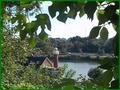
Ligth House on Boat House Rowby dv_rockComment by Artyste: I would have liked to have seen better focus on the distant subject, which would have given a higher mark. Good vision of the challenge though, in my opinion. |
| Photographer found comment helpful. |
| 08/31/2004 09:19:52 PM |
|
| Photographer found comment helpful. |
| 08/31/2004 06:37:12 AM |
|
| 08/29/2004 04:53:38 PM |
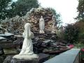
Sent From Up Aboveby dv_rockComment by mhoogendyk: This image needs to be re-thought. My reaction is that here are two pieces of statuary glued to some rocks with a jumble of rock and distracting plant patterns all around. I would try and see if I could take it in such a fashion that the major bright white space of sky disappears, the background clumps of bushes are cropped out, and the image concentrates on the top 80% of the foreground image and all of the background image. If you could then get some lighting effect showing the background figure with more brightness and detail, you would probably be heading in the right direction. But, hey! That's just MY opinion. I'm sure that there are plenty of others that WILL like it. The kneeling (nun?) could be an attractive image. |
| Photographer found comment helpful. |
| 08/29/2004 09:41:58 AM |
Sent From Up Aboveby dv_rockComment by ddng: It's a nice photo - depicts hope, hasn't been 'shoehorned in' and is a nice idea. But it doesn't have the wow factor, at least not for me. I feel it's a little busy? Maybe some cropping to make it a 'portrait' shape rathyer than a landscape and to bring the attention to the statues. I find the pink flowers distracting also as they are the only bright colour in the photo. |
| Photographer found comment helpful. |
| 08/28/2004 09:17:00 AM |
|
| 08/27/2004 09:21:25 PM |
Sent From Up Aboveby dv_rockComment by siggi: wall on lower right leeds you out of the picture, I would try a tighter crop getting most of the wall out. Try useing a higher F stop geting both statues into focus. |
| Photographer found comment helpful. |
| 08/26/2004 03:06:10 PM |
|
Home -
Challenges -
Community -
League -
Photos -
Cameras -
Lenses -
Learn -
Help -
Terms of Use -
Privacy -
Top ^
DPChallenge, and website content and design, Copyright © 2001-2026 Challenging Technologies, LLC.
All digital photo copyrights belong to the photographers and may not be used without permission.
Current Server Time: 07/16/2026 07:44:10 AM EDT.