| Image |
Comment |
| 01/17/2005 10:48:10 AM |
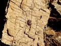
Itsy Bitsyby dv_rockComment by dwolff: Focus is good but the subject is a little too hard to see as it blends with its background. |
| 01/16/2005 05:17:59 PM |
Itsy Bitsyby dv_rockComment by ButterflySis: Lighting is harsh and the spider blends in to the bg making it hard to spot him. His body is easy to see but the legs aren't. |
| 01/16/2005 02:58:59 AM |
Itsy Bitsyby dv_rockComment by samtrundle: The spider here blends in a little too closely with the background. (Which is unfortunately a little too busy). Good idea though - nice to see you've chosen a spider as your subject rather than some colourful, more cliched insectoid subject. |
| 01/16/2005 02:08:38 AM |
Itsy Bitsyby dv_rockComment by Art Roflmao: Composition: 7, Nothing in image to indicate scale
Technical: 8
Appeal: 6
Challenge: 10
Overall Score: 6, (weighted) - Pretty Cool shot! |
| 01/11/2005 01:36:06 PM |
|
| 01/11/2005 10:30:58 AM |
|
| 01/06/2005 11:08:26 AM |
Blend Inby dv_rockComment by sibeling: There's a lot going on in the photo, with all the verticals of the jungle gym, swing set, fence & trees, that my eyes just don't know where to settle. I think it needs to be a little sharper, and I would maybe fix the tit of the photo. I do like how your "waldo" is not just sitting around and the color of his jacket matches the gym set. Good effort! |
| 01/06/2005 06:03:20 AM |
|
| 01/05/2005 09:03:39 AM |
Blend Inby dv_rockComment by Prof_Fate: A bit busy - the tree on the left and the pond up front , the swingset and fence on the right...and the focus seems soft, sould be the flat lighting, and it does not seem level.
On the + side, it meets the challenge and has no bad border. And it is not b&w. I am getting tired of b&w.
perhaps move left and lower - the pond in teh foreground is a good idea, but there is not enouhg of it here. more telephoto lens perhaps to narrow the field of view and cut out the swings. Definitely needs some better focus and/or some USM in PP. |
| 11/21/2004 09:19:03 PM |
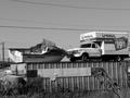
Only $19.95by dv_rockComment by cghubbell: There are many distractions in this image, which beg the question, what is the photgrapher trying to show me? There is interest in the boat vs. truck, yet there are power lines, a foreground tree, eye-grabbing lines on the metal container. I'd sugegst trying to find an angle that minimizes distractions and emphasizes your intended subject. |
Home -
Challenges -
Community -
League -
Photos -
Cameras -
Lenses -
Learn -
Help -
Terms of Use -
Privacy -
Top ^
DPChallenge, and website content and design, Copyright © 2001-2026 Challenging Technologies, LLC.
All digital photo copyrights belong to the photographers and may not be used without permission.
Current Server Time: 07/16/2026 01:41:06 AM EDT.