| Image |
Comment |
| 04/18/2006 07:53:10 AM |
Serenityby alexgarciaComment by dwterry: I feel that turning her head just a little more towards the light, bringing a little more light on her right eye (left side of image) would help, plus a sharper focus on the eyes. |
 Photographer found comment helpful. Photographer found comment helpful. |
| 04/18/2006 07:30:08 AM |
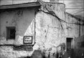
Houseby alexgarciaComment by goc: hi,
well what to say, the composition could be much improved with moving the frame in either direction just not to get angle of the house in the middle of the frame, the tonal range and details are very good, as i mentioned for composition the cut off chimney is not very nice to see, with this in mind the photo lacks definition, the B&W is good choice but i would like to see it in color also,
i do think however that there are awesome posibilities with taking photos of this building, try different angles, funny compositions or something else...
peace,
goran |
| Photographer found comment helpful. |
| 04/18/2006 07:21:35 AM |
|
| Photographer found comment helpful. |
| 04/18/2006 07:20:36 AM |
Houseby alexgarciaComment by Perfecti0n: I think that it is an extremely good idea and nice shot. I really like the clouds in the back and the door of the building. Those stand out to me, no real reason why. |
| Photographer found comment helpful. |
| 04/18/2006 07:11:44 AM |
Houseby alexgarciaComment by elee3009: Hi, I like the b&w tones here and I think the greys are very nice. But on the whole, I'm not sure where you want me as a viewer to focus on. I don't get a feel of the house overall as my eye is constantly drawn to the middle where the two walls merge. The angle makes it look a little flat. Perhaps a different angle will help but not being there, I really can't offer up more useful ideas (sorry). :) |
| Photographer found comment helpful. |
| 04/18/2006 07:08:31 AM |
Houseby alexgarciaComment by dahkota: Take Ed's advice - he is right on the money. My own thoughts? Showing this much building, its disturbing that there is no ground. I know its there - the door ends. As it is, I get the sense that I'm nowhere - I don't have anything to stand on to view this image. The texture of the sky is great, but in this image it fights with the texture of the walls for attention. The corner of the building cuts this image nearly perfectly in two. I think you need to decide what drew you to the building and concentrate on that. If it is the building as a whole, pull out and show us the surroundings so we get a sense of place. You have the eye to find interesting things; now you have to decide what is most interesting and focus on that. I am very intrigued by the wheel in the window - I want more. Maybe this building is many images of parts rather than one image of the whole. |
| Photographer found comment helpful. |
| 04/18/2006 06:31:14 AM |
Houseby alexgarciaComment by e301: I'm not sure that you haven't slightly fallen between two stones here; it has elements of trying to show two things: the house in itsw location, and the details and textures of it's walls and the shadow-play of a moment of light. The location aspect doesn't work too well - you're just too close, too cropped maybe; and yet the details side isn't so effective for me for the opposite reason - not close enough. What seems immedaitely clear is that the real power in the image could be framed in an area comprising of the window image left, the street sign, the pipework and the shadows assoiated with them: I think that would tell almost as much, if not more for the sake of the detail, this full-face image. The tightness of the cropping to the roof and chimney doesn't help you - makes it feel like the whole thing couldn't be got it and this was the next best: perhaps sometimes all you actually need is a detail to illuminate the whole story?
The conversion seems OK - though I might like a touch more graduation in the shaded areas, you have the highlights well under sontrol it seems. The right hand section of wall seems unnaturally dark, where it should surely be as bright as the area around the street sign? I think that disturbs the threee-dimensionality of the image a little ... |
| Photographer found comment helpful. |
| 04/17/2006 04:21:04 PM |
Serenityby alexgarciaComment by RKT: There is just something about this image that just somehow rings so true...as if you have captured a candid moment between the "posed" shots...the light is also so very nice...very gentle...very nice work. |
| Photographer found comment helpful. |
| 04/17/2006 07:12:45 AM |
|
| Photographer found comment helpful. |
| 04/16/2006 05:56:17 PM |
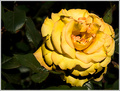
Rosa, rosaeby alexgarciaComment by fotomann_forever: ::: Greetings from Critique Club :::
Hi, as requested, here is an indepth critique of your submission.
First Impression - the most important one:
Wow, no comments? How'd that happen? It's a nice stock flower shot, but doesn't have anything to draw the voter to the top end of the scale.
Composition:
I hate to say it, but the composition is boring. Half the frame is flower, half background. It just doesn't have anything that grabs your eye.
Subject:
Subject is clear and in focus. DoF works well here.
Technical (Color, focus, and light):
Focus looks good. Color may be a bit over-saturated, but looks good. Lighting seems a bit on the harsh side for a flower shot.
To grow its vote?:
Stay away from the flowers ;-) Really, I think DPC is going through an anti-flower stage, This image should have at least scored in the 5+ range.
Summary:
Flower shots are pretty, but making one that really slaps a voter in the face and makes them want to give it a high score is hard. Flower shots are like opinions, everyone has one, so they are hard to pass off.
Hope to see more from you soon,
Leroy |
| Photographer found comment helpful. |
Home -
Challenges -
Community -
League -
Photos -
Cameras -
Lenses -
Learn -
Help -
Terms of Use -
Privacy -
Top ^
DPChallenge, and website content and design, Copyright © 2001-2026 Challenging Technologies, LLC.
All digital photo copyrights belong to the photographers and may not be used without permission.
Current Server Time: 06/22/2026 05:47:39 AM EDT.