| Image |
Comment |
| 04/19/2007 09:45:05 PM |
|
 Photographer found comment helpful. Photographer found comment helpful. |
| 04/19/2007 09:06:46 PM |
|
| Photographer found comment helpful. |
| 04/19/2007 07:25:33 PM |
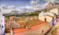
Landscape from my windowby alexgarciaComment by Ivo: I really like the perspective and the WA distortion. The processing seems a bit too "Norman Rockwell" for my taste but well done in any case. |
| Photographer found comment helpful. |
| 04/19/2007 02:12:41 PM |
|
| Photographer found comment helpful. |
| 04/19/2007 09:19:23 AM |
|
| Photographer found comment helpful. |
| 04/18/2007 09:37:33 PM |
|
| Photographer found comment helpful. |
| 04/18/2007 07:37:42 PM |
|
| Photographer found comment helpful. |
| 04/18/2007 07:18:11 PM |
|
| Photographer found comment helpful. |
| 04/18/2007 02:42:43 PM |
Getting rustyby alexgarciaComment by Artifacts: Positives:
Certain technical features work well with this image. The diagonal composition, general color and depth of field are good.
Technicals:
As I said... DOF, color and diagonal composition are good. It is slightly oversharpened and that negatively affected voting. That is a critical feature of this particular image.
The Challenge:
Yes, it meets the challenge and the coloring on the chain also works well, but viewers sometimes want more in a 'chain' composition than what they see in yours and the sharpening issue affected their evaluation.
Suggestions:
Back off on the overall sharpening of the image, but not a lot... whatever that means. :) In technical terms if you duplicate a flattened image layer and apply sharpening to the duplicated layer and then adjust the opacity of the sharpening layer to make it 'correct' is a good approach to take. Outside chosing a different composition or subject, that is about the only thing you can do to improve this composition. |
| Photographer found comment helpful. |
| 04/18/2007 01:32:18 AM |
Landscape from my windowby alexgarciaComment by Tim: 36 photos into voting and this is the first HDR photo I've seen, and I thought everyone would be using HDR. Hopefully everyone who does pulls it off as well as you have, this processing is really quite nice.
Although I'm not too impressed with the composition. it feels strange that the building in the centre of the photo is cut off so much. really the mountains and the other buildings are the best part of the photo and the bottom left third of the photo is really wasted |
| Photographer found comment helpful. |
Home -
Challenges -
Community -
League -
Photos -
Cameras -
Lenses -
Learn -
Help -
Terms of Use -
Privacy -
Top ^
DPChallenge, and website content and design, Copyright © 2001-2026 Challenging Technologies, LLC.
All digital photo copyrights belong to the photographers and may not be used without permission.
Current Server Time: 06/22/2026 08:58:05 AM EDT.