| Image |
Comment |
| 02/24/2006 01:56:35 PM |
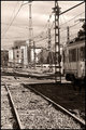
Way to the stationby alexgarciaComment by Tuckersmom: I like the fact that you went with a more sepia like tone on this one, I think it helps with the feel of the shot. Maybe it's my eyes or an optical illusion, but it looks just a big unhorizontal? Good composition and detail. |
 Photographer found comment helpful. Photographer found comment helpful. |
| 02/24/2006 01:54:42 PM |
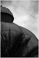
Market domeby alexgarciaComment by Tuckersmom: Nice tones on this one. I like how the sky is not overdramatically done, it looks very natural which I like. The one thing I don't care for is the palm fronds. The building looks very cool and they kind of detract from it. Maybe shooting from a different angle? Good job |
| Photographer found comment helpful. |
| 02/24/2006 01:53:01 PM |
Flyingby alexgarciaComment by Tuckersmom: I do like this in black and white. The clarity is great as has been mentioned. I don't care for the centeredness of it, maybe a different crop or a rotate and crop? Just a thought. |
| Photographer found comment helpful. |
| 02/24/2006 01:51:40 PM |
Market domeby alexgarciaComment by missinseattle: I'd like to see this in color. I'm not a big fan of b&w unless it's something like a really old building of some sort, or people. I like the way it's cropped though. |
| Photographer found comment helpful. |
| 02/24/2006 01:50:40 PM |
Flyingby alexgarciaComment by missinseattle: I think this would be better not in b&w. It's really hard on the eyes. That being said the bird is very clear as far as being able to see the details in the feathers and whatnot. |
| Photographer found comment helpful. |
| 02/24/2006 12:03:45 PM |
|
| Photographer found comment helpful. |
| 02/24/2006 08:36:54 AM |
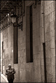
Sundayby alexgarciaComment by persimon: Great comp. You don't realize how big the light and windows are until you see the man walking down on the sidewalk. I really like the tones and details. |
| Photographer found comment helpful. |
| 02/23/2006 06:49:36 AM |
|
| Photographer found comment helpful. |
| 02/23/2006 04:45:42 AM |
Sundayby alexgarciaComment by ubique: Very nice composition and processing. I suppose the absence of the man's legs will confuse some (a sad few may even be "distracted"). But I'm guessing that you deliberately cropped 'em out. Either way, I like it like this; it makes the photograph harder to "understand" and thus harder to easily dismiss! The stately old window openings and the formal balcony supports and lamp are nicely upset by the informality of the strolling man, smoking and reading his Sunday paper. 8. |
| Photographer found comment helpful. |
| 02/22/2006 08:44:58 PM |
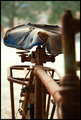
It's time to buy another bike, daddyby alexgarciaComment by Rikki: Nicely done and good use of DOF. I think there might be too much blur on the right hand side but aside from that, I love everything about it. the textures, colors, and emotive sense to it. Great work Alex. |
| Photographer found comment helpful. |
Home -
Challenges -
Community -
League -
Photos -
Cameras -
Lenses -
Learn -
Help -
Terms of Use -
Privacy -
Top ^
DPChallenge, and website content and design, Copyright © 2001-2026 Challenging Technologies, LLC.
All digital photo copyrights belong to the photographers and may not be used without permission.
Current Server Time: 06/22/2026 02:51:16 AM EDT.