| Image |
Comment |
| 10/21/2004 11:21:49 PM |
|
 Photographer found comment helpful. Photographer found comment helpful. |
| 10/21/2004 01:08:43 PM |
Kindergartenby ArnarpComment by melismatica: This meets the challenge but, sadly, it has a very amateurish, snapshot quality to it. A kindergarten coat room has a lot of potential for evoking nostalgia in the viewer but this just hasn't captured that. It looks like the photographer just stuck his/her head into a closet and snapped the shot. The flash hurts the mood quite a bit (flash frequently does). For an interior shot a tripod is usually necessary to take advantage of natural light. A suggestion for how a shot of a coat room could evoke an emotional response from the viewer is to create a set-up using just a few familar items you would find in the setting being sure to choose timeless, non-branded (no cartoons, sports teams, etc) items. Example---a brown paper lunch bag or plain colored lunch pail. galoshes (rain/winter boots), a simple nylon windbreaker or rain coat, Chuck Taylors' or Keds' sneakers (they've been around for several decades in pretty much the same form). |
| Photographer found comment helpful. |
| 10/20/2004 04:37:45 PM |
|
| Photographer found comment helpful. |
| 10/20/2004 11:52:49 AM |
Kindergartenby ArnarpComment by johnm: Love it. Very whimsical and charming. Good angle. Will probably score low on the DP Challenge though. 10 |
| Photographer found comment helpful. |
| 10/16/2004 01:08:25 PM |
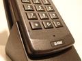
AT&T. How can I help you?by ArnarpComment by KaDi: Choosing to photograph only a portion of the phone means to me that you're thinking about your subject. But it seems that the composition is lacking in interest. You've used shallow depth of field, but it's not helping to point me to what must have been interesting to you. There's also a reddish cast to this....perhaps accentuating the contrast betwen the black phone and it's surrounding white would give this more graphic impact. |
| 10/13/2004 09:14:23 AM |
AT&T. How can I help you?by ArnarpComment by wewillexplore: Interesting angle, but lacks punch for me. I'd boost the contrast, but then I've been known to overcontrast, so what do I know? :) I don't like the logo being on there, but that's minor. 5 |
| 10/13/2004 03:45:09 AM |
AT&T. How can I help you?by ArnarpComment by Artyste: Your white balance seems a little off too me, and the lighting slightly harsh, especially in the upper right and on the buttons there. It's an OK shot of a phone, and definitely conveys communication, but remains just a little uninteresting. |
| 10/08/2004 05:40:01 PM |
|
| 10/08/2004 05:21:15 PM |
|
| Photographer found comment helpful. |
| 10/08/2004 01:54:40 PM |
|
| Photographer found comment helpful. |
Home -
Challenges -
Community -
League -
Photos -
Cameras -
Lenses -
Learn -
Help -
Terms of Use -
Privacy -
Top ^
DPChallenge, and website content and design, Copyright © 2001-2026 Challenging Technologies, LLC.
All digital photo copyrights belong to the photographers and may not be used without permission.
Current Server Time: 07/16/2026 08:08:30 AM EDT.