| Image |
Comment |
| 03/11/2005 01:06:46 PM |
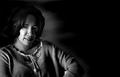
Yes He Took Portraits Alsoby Travis99Comment by Imagineer: While I know he took portraits, this strikes as too flippant in its execution to echo the great man's technique and choice of subject. OUtside of the challenge it's a good portrait, but for me, since the focus is Ansel Adams, it's a bit weak. The tones are very harsh too (narrow range) leaving the blacks too black and the whites too bright. Your editing is a little conspicuous on the hair also. Good, offset composition. |
| 03/10/2005 05:24:31 PM |
|
| 03/09/2005 10:09:05 PM |
|
| 03/08/2005 10:18:39 PM |
Picture 1786.jpgby Travis99Comment by dustin03: The tonnage look very well, and It appears ballanced and clean on my monitor with useing the "Safari" browser.
In "Explorer" Browser, it appears to have some problems with lines with the background.
I also have view it in PSCS, same problem with seeing waveing lines between the grads.
I have a IMAC G5 and color profile set to sRGB. |
| 03/07/2005 10:35:18 PM |
Yes He Took Portraits Alsoby Travis99Comment by srbrubaker: And he used directional light and got us to see strong textures - both strong points of this photo. I'm afraid most of my time looking at this phot has been in trying to figure out how the highlight behind the subject was made. And in this sense I find it highly distracting. I try to refocus on the subject, but I keep getting pulled away... |
| 03/07/2005 06:26:01 AM |
Yes He Took Portraits Alsoby Travis99Comment by garlic: I´ve no doubt that he did but they must have been better than this one. The composition is fine but the expression of the face seems strange and the image would have needed much better editing. |
| 03/06/2005 12:59:00 PM |
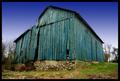
Old Barnby Travis99Comment by Elemmennope: I adore the color and character of the barn, but the way oversaturated sky hurts the image imo. |
| 03/04/2005 09:23:59 PM |
|
 Photographer found comment helpful. Photographer found comment helpful. |
| 03/04/2005 04:34:15 PM |
|
| Photographer found comment helpful. |
| 03/04/2005 03:54:22 PM |
Oakley Never Leave Home WithOut Themby Travis99Comment by Imagineer: A couple of things:
1. Nice reflection on the glasses and richness of tone.
2. The crop is unfortunate. You could have enlarged the shades in the frame and cropped out the intrusive black area at the bottom. This would then leave the glasses as 'hero' and leave just enough space for minimal text and logo. As it stands, the first thing you're aware of is the table edge.
3. shot is a touch noisy. You could try running it through neat Image (or equivalent) or converting to lab color mode in Photoshop and blurring the channels 'a' and 'b' until the noise is reduced. This leaves the definition (Lightness channel) intact.
And lastly, Oakleys are unfortunately terribly made!! If you look at the stems you'll probablly notice some poor spraying. They're WAY over-priced compared to some much better brands (Adidas, RayBan) for equivalent outlay. |
| Photographer found comment helpful. |
Home -
Challenges -
Community -
League -
Photos -
Cameras -
Lenses -
Learn -
Help -
Terms of Use -
Privacy -
Top ^
DPChallenge, and website content and design, Copyright © 2001-2026 Challenging Technologies, LLC.
All digital photo copyrights belong to the photographers and may not be used without permission.
Current Server Time: 07/27/2026 04:15:05 PM EDT.