| Image |
Comment |
| 08/25/2005 06:08:56 PM |
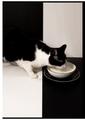
Tastefulby fotodudeComment by tuffy: Great use of B&W! I like the arrangement...wish it was in sharper focus |
 Photographer found comment helpful. Photographer found comment helpful. |
| 08/25/2005 05:21:29 PM |
Tastefulby fotodudeComment by CLarson557: I really admire your creativity and eye with this photo. The use of the B&W background is neat and very fitting with the B&W kitty etc. Just a couple of things that I think would improve this shot even better, IMO. 1 - I'd like to see the whites more white by getting rid of the slight yellow hue. 2 - The border. I don't really like the uneven lines. It is kind of distracting. score = 8 |
| Photographer found comment helpful. |
| 08/25/2005 05:16:54 PM |
Tastefulby fotodudeComment by macrothing: 8 - Like this, like the frame, like the colors, like the 'style'. For me, even though the first thing I see is not 'milk/etc', my eye gets drawn there fast enough. Criticism; maybe, (though likely impossible seeing as the left top black background is likely 'wall') would like to see how this would have looked with the cat 'symmetried' over the top left black 'corner' (ie; diagonal). Otherwise, somehow more definition on the 'lapping' of the milk, and also on the white whiskers that are against the black right foreground. |
| Photographer found comment helpful. |
| 08/25/2005 04:16:31 PM |
Tastefulby fotodudeComment by Roots: That looks really good. The checkers in contrast with the cats natural markings, and the black and white bowl. I enjoy this. |
| Photographer found comment helpful. |
| 08/25/2005 01:46:12 PM |
Tastefulby fotodudeComment by DrAchoo: I like the idea and the background. The cat disappearing completely into the black is a little disconcerting, but I'd have to see it the other way to know if it was better. 8. |
| Photographer found comment helpful. |
| 08/25/2005 01:31:42 PM |
Tastefulby fotodudeComment by lshles: What can I say?! Impeccably composed. Beautiful black and white. Wonderful!
On second thought, I might have moved the cat a bit up or down in the composition. |
| Photographer found comment helpful. |
| 08/25/2005 12:54:24 PM |
|
| Photographer found comment helpful. |
| 08/25/2005 08:23:37 AM |
|
| Photographer found comment helpful. |
| 08/25/2005 01:15:35 AM |
Tastefulby fotodudeComment by nance-c: Cool! Excellent idea. I would have liked for the lighting to be more even-- the white is white enough at the bottom, but it gets gray at the top. |
| Photographer found comment helpful. |
| 08/24/2005 09:42:00 PM |
On a Cloudby fotodudeComment by OdysseyF22: Good idea, but the entire shot is just a little too white. A touch more contrast, to life the legs away from the background, would have improved this a lot! Still, a good shot! 7 |
| Photographer found comment helpful. |
Home -
Challenges -
Community -
League -
Photos -
Cameras -
Lenses -
Learn -
Help -
Terms of Use -
Privacy -
Top ^
DPChallenge, and website content and design, Copyright © 2001-2026 Challenging Technologies, LLC.
All digital photo copyrights belong to the photographers and may not be used without permission.
Current Server Time: 07/18/2026 07:50:07 AM EDT.