| Image |
Comment |
| 05/11/2006 09:55:50 PM |
|
 Photographer found comment helpful. Photographer found comment helpful. |
| 05/11/2006 09:23:30 PM |
|
| 05/11/2006 04:09:12 PM |
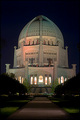
B'hai Holy Placeby fotodudeComment by fluxn: cool architecture, but nothing really compelling about the photo. looks like it's leaning to the right a little. |
| 05/11/2006 03:54:33 PM |
|
| Photographer found comment helpful. |
| 05/11/2006 10:26:14 AM |
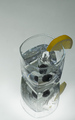
Refreshby fotodudeComment by notonline: **Greeting from the Critique Club**
Well, the first thing I noticed in this image was either the sensor dust or dirt on the mirror. I would also have liked to see the "photographers comment" box filled out.
I would have like to see a tigher crop off the top as I find the negative space there to be a waste but just becase of its size. I like the angle of the glass but the water droplets on the rim of it I find to be a little distracting. I would have also liked to see the yellow from the lemon pop a bit more which could have been done through post-processing. Actually tho whole image could use a bit of brightening. There is no hotspots from the ice or glass which I find a lot of people don't see when shooting shiney objects. I do like the never ending mirror look tho as it draws the eyes into the nothingness. All in all it is not a shot I'd hang on my wall but one I would (if cleaned up) see in an advertisement. Good luck and keep up the good work. |
| Photographer found comment helpful. |
| 05/09/2006 04:22:17 PM |
|
| Photographer found comment helpful. |
| 05/09/2006 07:49:34 AM |
Crystal Complementby fotodudeComment by ericwoo: Hey there from the Critique Club
Aesthetically, you achieved a fairly pleasing image, but this one really lacks creativity. Scoring 6.2+ on this one is about the best I think it could have done. Your focus is crisp and your exposure is dead on for this shot, but this type of image is well overdone on this site. Its just been done so many times in recent history, that I think voters are growing weary of it. You clearly captured a great image here that has fantastic elements and meets the challenge to a tee. Technically, the only issues I see are the glass reflection and the shadow at the top where the paper meets. I do believe that the symmetry serves this capture very well. I'd consider using past challenges for ideas and guideposts more than making attempts to recreate them. I hope that this critique helps out. |
| 05/09/2006 06:19:19 AM |
|
| Photographer found comment helpful. |
| 05/09/2006 02:49:43 AM |
|
| Photographer found comment helpful. |
| 05/08/2006 08:09:57 PM |
|
| Photographer found comment helpful. |
Home -
Challenges -
Community -
League -
Photos -
Cameras -
Lenses -
Learn -
Help -
Terms of Use -
Privacy -
Top ^
DPChallenge, and website content and design, Copyright © 2001-2026 Challenging Technologies, LLC.
All digital photo copyrights belong to the photographers and may not be used without permission.
Current Server Time: 07/16/2026 08:57:56 AM EDT.