| Image |
Comment |
| 11/29/2004 11:45:01 PM |
BEEtleby fotodudeComment by magicshutter: Dude, seriously, this is awesome in too many aspects to list here. Me and the wife are rollin' |
 Photographer found comment helpful. Photographer found comment helpful. |
| 11/29/2004 12:43:33 AM |
BEEtleby fotodudeComment by Joey Lawrence: How you ever got that in there, I will never know...:)
However, I presuve the car is small but the grainyness is distracting. |
| Photographer found comment helpful. |
| 11/28/2004 11:07:11 PM |
|
| Photographer found comment helpful. |
| 11/28/2004 01:48:01 PM |
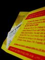
To "Authority" ¢25=$25by fotodudeComment by Mark of SRQ: Good idea for the challenge. Like the composition, and set up. A little dull as far as a general photo, but for the challenge it works. Perhaps omitting "To 'Authoroity'" in the title would have made more of an impact. I find people generally don't like when you add the challenge name in the title. I can't make out what country this is from, but it must not be America. In America we put the "cents" symbol after the number. But I found out after a recent trip to another country that we do everything backwards. |
| Photographer found comment helpful. |
| 11/28/2004 08:14:11 AM |
To "Authority" ¢25=$25by fotodudeComment by Skip: even worse is to find your car was towed for unpaid parking tickets, and then to have to pay all the tickets and the tow charge...yep, a couple quarters can go a long way. i think your image is ok, but could have been stronger if the ticket was pulled out to cover the hotspots on the envelope edge, and maybe shot rotated a little to the right so as to make the DO NOT SEND CASH really stand out. |
| Photographer found comment helpful. |
| 11/27/2004 04:18:45 AM |
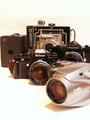
What's Next?by fotodudeComment by e301: Good high-key work - thank god you haven't gone for the 'perfectly' white background which is so annoying to the eye. I can't say I like the composition of subject very much - though it does have a strong element of recession to it, I think it has become too complicated; my temptation would be to have lined them up more, use a stronger diagonal composition ... but I'm not certain that would work any better :-) A pretty common subject approach too. |
| Photographer found comment helpful. |
| 11/25/2004 09:30:05 PM |
|
| Photographer found comment helpful. |
| 11/24/2004 01:25:04 PM |
|
| Photographer found comment helpful. |
| 11/24/2004 01:14:07 PM |
|
| Photographer found comment helpful. |
| 11/24/2004 01:43:00 AM |
To "Authority" ¢25=$25by fotodudeComment by vontom: The question: is this happenstance, or did you get a ticket just for the challenge? :P Nice, vivid colors, but the white is a litle grey. Perhaps the camera metering was a little off for this shot. |
| Photographer found comment helpful. |
Home -
Challenges -
Community -
League -
Photos -
Cameras -
Lenses -
Learn -
Help -
Terms of Use -
Privacy -
Top ^
DPChallenge, and website content and design, Copyright © 2001-2026 Challenging Technologies, LLC.
All digital photo copyrights belong to the photographers and may not be used without permission.
Current Server Time: 07/16/2026 02:10:33 AM EDT.