| Image |
Comment |
| 05/01/2005 01:10:32 AM |
|
| 05/01/2005 12:15:40 AM |
|
| 04/30/2005 05:02:07 PM |
|
| 04/30/2005 02:15:17 AM |
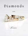
Diamond Wedding Ringby -crtComment by hamidjalal: Using the same font for "are" and "forever" could have enhanced the immage a thoudsand times... especially the font used for "forevenr" looks pretty good. |
 Photographer found comment helpful. Photographer found comment helpful. |
| 04/29/2005 07:33:12 PM |
|
| 04/29/2005 06:37:14 PM |
|
| 04/29/2005 07:20:26 AM |
Diamond Wedding Ringby -crtComment by SnapperL: Very nice. the clarity on the rings is great. The stones are shining up good. I like the shimmer the floor gives also. Font is nice as well. 10 |
| Photographer found comment helpful. |
| 04/29/2005 06:46:04 AM |
Diamond Wedding Ringby -crtComment by Nuno: Good photo. Nice light, gives it a 3 dimensional look. Don't aprove the 2 different tipe of letters though.8 |
| Photographer found comment helpful. |
| 04/29/2005 12:28:50 AM |
Diamond Wedding Ringby -crtComment by awpollard: Nice, Clean and Simple. This is a very good shot. I personally would have stayed with one font throughout the advert, completely different fonts tend to make my interest point switch between the top and bottom of the shot making the rings secondary. The same font here would act to frame the ring keeping my interest in the center of the shot. The rings themself seem a little soft and lacking detail but this is still a very good shot and I marked it higher than most. |
| Photographer found comment helpful. |
| 04/28/2005 09:24:11 PM |
|
| Photographer found comment helpful. |
Home -
Challenges -
Community -
League -
Photos -
Cameras -
Lenses -
Learn -
Help -
Terms of Use -
Privacy -
Top ^
DPChallenge, and website content and design, Copyright © 2001-2026 Challenging Technologies, LLC.
All digital photo copyrights belong to the photographers and may not be used without permission.
Current Server Time: 07/15/2026 07:44:24 PM EDT.