| Image |
Comment |
| 07/24/2006 12:54:06 PM |
Side by side.by NospeakComment by Rino63: * Greeting from Critique Club *
I think that here you want a representation of a view of the human progress from the nature point of view.
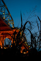
If I understand your idea I think that is a good idea. I am perplexed about the realization. too dark the plants, they occupy too much space in the frame and too much little occupy the bridge. It result that the photograph is too dark. from compositive point of view I think that you can to raise the machine and obtain two good effects, the first is a smallest dark area in the lower frame and the second is the bridge in the left upper corner without to lose the diagonal of the plant.
Best Regards
|
| 07/18/2006 06:42:53 PM |
|
| 07/15/2006 07:34:47 PM |
|
| 07/15/2006 04:13:24 PM |
Side by side.by NospeakComment by Melethia: Nature continues to progress despite man's interference - at least that's kinda what I see. Love the red of the underside of the bridge. |
| 07/13/2006 11:02:19 PM |
|
| 07/12/2006 04:37:10 PM |
Side by side.by NospeakComment by Nuzzer: I see what you were going for here but the plants just look as if they are secondary to the bridge |
| 07/12/2006 03:45:54 PM |
Side by side.by NospeakComment by RhinoStar: Beautiful photo. I love the hues in the sky and bridge. The best one with the "nature vs. man" theme. 9 |
| 03/03/2006 04:10:49 PM |
Vigil.by NospeakComment by jmsetzler: Greetings from the Critique Club...
First of all, I think it's important that you include your camera settings when requesting a critique. That information is beneficial to me when offering you suggestions on how to improve your work :)
I think this is an excellent subject for a black and white photo. I also applaud the camera tilt. I do that quite frequently myself to create imbalance and added dynamics. This particular subject seems to have a lot of smaller composition opportunities within the field of view you have presented here as well.
Per your notes, I believe you were going for a dark sky effect, and it seems to have worked out to some degree, but I believe the rest of the image may be slighly underexposed by the methods you chose to achieve that effect. The highlights are almost there, but not quite. You may be able to improve this effect by using a polarizer. The polarizer will darken the sky without much loss on the existing highlights in the scene... |
 Photographer found comment helpful. Photographer found comment helpful. |
| 02/28/2006 01:17:17 PM |
|
| Photographer found comment helpful. |
| 02/26/2006 02:12:18 PM |
Vigil.by NospeakComment by hideout: Great subject for this post-processing challenge. I do like the angle you've chosen, I would've kept her wing matching the right border though, I am just to symmetrical probably. |
| Photographer found comment helpful. |
Home -
Challenges -
Community -
League -
Photos -
Cameras -
Lenses -
Learn -
Help -
Terms of Use -
Privacy -
Top ^
DPChallenge, and website content and design, Copyright © 2001-2026 Challenging Technologies, LLC.
All digital photo copyrights belong to the photographers and may not be used without permission.
Current Server Time: 07/02/2026 06:04:53 PM EDT.