DPChallenge: A Digital Photography Contest You are not logged in. (log in or register
 
Browse Settings
Currently viewing:
Registered UserHeavy

Show comments:

Per page:

Order:

Comments:


Comments Received by Heavy
Pages:   ... ... [72]
Showing 201 - 210 of ~713
Image Comment
Ye Olde Clothesline
03/25/2005 08:44:00 PM
Ye Olde Clothesline
by Heavy

Comment by Cutter:
Simple, poor composition. Cut off 1/8 of the left and you have a lot higher average score. But wonderful clarity and color and background.
Photographer found comment helpful.
Please Play !
03/25/2005 06:04:07 PM
Please Play !
by Heavy

Comment by moosetrax:
very pretty eyes
Photographer found comment helpful.
Please Play !
03/24/2005 11:49:24 PM
Please Play !
by Heavy

Comment by conceptphoto:
Good photo, but the hat just throws me for a loop and the idea isn't very original. 4
Photographer found comment helpful.
Silhouetted Leaf
03/23/2005 09:37:00 PM
Silhouetted Leaf
by Heavy

Comment by magnon:
Greetings from the Critique Club!

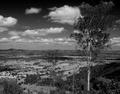
A few things that come to mind about this image has already been commented - the image is a little busy, since there's no natural point of rest to my eye on this one. I think that you could create a better silhouetted leaf with a simple lighting setup, and get a better result, since the sunlight is a bit intrusive (esp. at the right end).

Composition is a subjective thing, and my opinion is that it could be changed so there's a vanishing point or a clearer subject - another perspective could help this image, I think. However, I can only state my feelings about it, and your intention is by far the most important.

You have, however, captured good color and detail here. There are many shades of green color, and a good dynamic range. You state in your portfolio that you want to know your camera better - well, I think you know it pretty well. It's a sharp image with enough depth to cover the entire image (which is appropriate for the composition you chose), it's sharp and clear, and well exposed except that I think you could've chosen another way of lighting. So technically, this is a well done thing. You also seem to know post-processing, as it is not evident in the image what you have done (a good thing, I think).

It meets the challenge, of course, but still, this is a rather wide subject.

Keep on working, good luck at top 10!

If you have any comments about my critique, please PM me.
Photographer found comment helpful.
Please Play !
03/23/2005 06:11:20 PM
Please Play !
by Heavy

Comment by xonkas:
Though this is a terrific portrait, with great definition and quality, the idea is definitely not original. The picture doesnt stand out for its concept or subject, but only for its quality. As a voter, tired of seeing many bored faces, I have to say that I'll score this one a bit lower than I would in other context.
Photographer found comment helpful.
Ye Olde Clothesline
03/22/2005 01:21:31 PM
Ye Olde Clothesline
by Heavy

Comment by Zap228:
Amazing sky, but this photo has no appeal to me from a buyers standpoint
Photographer found comment helpful.
Ye Olde Clothesline
03/21/2005 05:02:55 PM
Ye Olde Clothesline
by Heavy

Comment by reflux:
beautiful colour in the sky and great diagonal flow
Photographer found comment helpful.
Rural Countryside
03/19/2005 04:48:44 PM
Rural Countryside
by Heavy

Comment by jmoore:
Critique Club
Heavy, i think that you nailed the tones that Ansel Adams had in his photos. however I think that you are lacking his eye for the landscape scene. While you picture is very nice, I think it could be improved. The sky is the most fasinating part of the picture, the land is a bit boring to me. And your perspective is at eye level which can take away from the scene. Everyone is so used to seeing at this angle that when new angles are introduced through photographs it becomes more intesting to the eye. Your photo is also split down the middle with the horizon right at the center. I would have like to see you shoot from ground level and have the horizon in the bottom thrid of your photograph. This would not only make your tree feel larger than life, but it would give you more of the dramatic sky. I like that you place the tree off centered. Overall, I think you did a good job, when you go out make sure you shoot from different angles and try to keep your horizon out of the center. Good job on tones!
Photographer found comment helpful.
Silhouetted Leaf
03/17/2005 01:16:58 PM
Silhouetted Leaf
by Heavy

Comment by magnon:
I think I would like to see the line stop, some negative space in this shot. And, the lighting you use should be set up by you, so you won't have excessive sunlight in the background :)
Photographer found comment helpful.
Silhouetted Leaf
03/17/2005 06:28:22 AM
Silhouetted Leaf
by Heavy

Comment by Xilebo:
Like the lighting in this image
Photographer found comment helpful.
Pages:   ... ... [72]
Showing 201 - 210 of ~713


Home - Challenges - Community - League - Photos - Cameras - Lenses - Learn - Help - Terms of Use - Privacy - Top ^
DPChallenge, and website content and design, Copyright © 2001-2025 Challenging Technologies, LLC.
All digital photo copyrights belong to the photographers and may not be used without permission.
Current Server Time: 09/13/2025 11:32:03 PM EDT.