| Image |
Comment |
| 08/11/2003 12:06:46 PM |
|
 Photographer found comment helpful. Photographer found comment helpful. |
| 08/11/2003 10:37:36 AM |
|
| 07/26/2003 02:30:21 PM |
Garden Flowerby dphillipsComment by dsidwell: Interesting colors and tones. Seems surreal somehow. Flower contrasts well with dark and muddled background. |
| Photographer found comment helpful. |
| 07/25/2003 11:56:29 PM |
|
| Photographer found comment helpful. |
| 07/24/2003 06:19:51 PM |
Garden Flowerby dphillipsComment by ellamay: i like the colors and clarity of the flower, my only sort of negaive comment is should this photo be rotated somehow? feels sideways-- but what do I know. |
| Photographer found comment helpful. |
| 07/22/2003 10:19:05 PM |
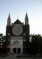
"Trinity" at sunsetby dphillipsComment by miller: I'm not really sure if I like the lighting because it emphasizes the sky more than the church. I think the composition could be better, too. I would suggest more of an angle or shoot it straight on to show the symmetry. There are some shots where forcing the rule of thirds doesn't work. |
| 07/21/2003 11:44:15 PM |
|
| Photographer found comment helpful. |
| 07/21/2003 11:12:31 AM |
|
| Photographer found comment helpful. |
| 07/21/2003 09:48:07 AM |
Garden Flowerby dphillipsComment by e301: This is a cool shot - but really it\'s only of that flower: where is the other element to contrast it with? What other elements there are seem almost accidental - and the de-saturation has left arteffacts behind. |
| 07/20/2003 08:13:52 AM |
These FEET were meant for Walkingby dphillipsComment by inspzil: Greetings from the Critique Club
By Inspzil
Composition - I don't really know what question I'm supposed to be asking myself on this one. I don't know what you were going for here. I don't feel this one meets the challenge all that well, if at all. This photo has very limited scoring potential based on the pure composition of it. It doesn't have any vibrant colors, clever or creative angles or perspectives and no real compelling subjects. The other side of that coin, the emotive, sentimental side is also not evident in this picture. That leaves it hanging in oblivion. The lighting is flat, the angle is boring, and the subjects are not compelling at all.
Technical - Nothing really wrong with this picture, but it needs something desperately to make it a little better. It seems focused reasonably well, but not as sharp as it could be. I'm not sure what you could do with this picture technically to make it more appealing to the masses.
Overall - Not a very strong picture and the score shows that as well as anything. Choice of subject is a lot of it. Not showing us anything new or different in terms of the subject and its perception is a lot of it. I don't feel its terribly challengeworthy or topic worthy (and frankly I can usually make almost every picture fit, even loosely). I would say that there isn't a remedy for this picture. There isn't any one thing that's going to make it a contender. Tuck it under your belt for a learning experience and move on the next week. I hope you can appreciate my points, even if they are a little harsh. Its hard to make anything I've said in this whole critique sound good. I got tired of trying so I just laid it out like I saw it. Good Luck to you and take care - Bob |
| Photographer found comment helpful. |
Home -
Challenges -
Community -
League -
Photos -
Cameras -
Lenses -
Learn -
Help -
Terms of Use -
Privacy -
Top ^
DPChallenge, and website content and design, Copyright © 2001-2026 Challenging Technologies, LLC.
All digital photo copyrights belong to the photographers and may not be used without permission.
Current Server Time: 07/16/2026 12:00:55 PM EDT.