Iron Willby
megryanComment by HBunch: *Critique Club*
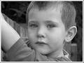
The first thing I notice here is that there really are no whites. The image is quite grey, even the whites of his eyes are grey. I played with this a little bit and adjusted contrast and brightness and it seemed like it came out a bit too bright, especially on his face. I bet that was the reason you chose to go greyish instead of 'too brightish'. The only solution I would see to that would be some selective editing to make some areas whiter, without making the already lighter areas too bright.
There is a diagonal line from the fence that goes directly through the center of Ryan's head. What looks like the rest of the fence then comes out the back of his head under his ear. It doesn't seem from your description that you had a lot of time to worry about background elements, but it does kind of create an odd visual of the head being 'chopped off' by background elements. What happens there, is that we look at the subject (the boys head) and then items 'coming out of his head' draw us away from his face. In this case, my eyes want to follow the diagonal in the background, and almost skip right over him.
Focus and clarity are really good in my opinion. I like the detail in his face and hair. I like how the background is blurred leaving more focus on the subject himself.
Without the explaination, it seems odd to cut his arms off like that, but I see why and it makes sense now and it's a funny story.
Overall I think it's a fine portrait of this cute young man. With a different angle on the background and brighter whites, I think this would be perfect. As is though, still a nice photo for the albums. :)
~Heather~