| Image |
Comment |
| 07/30/2004 05:00:28 AM |
|
 Photographer found comment helpful. Photographer found comment helpful. |
| 07/30/2004 01:34:32 AM |
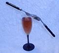
Simple Eleganceby bmatt17Comment by bmatt17: Originally posted by Imagineer:
Hello from the Critique Club!
......................................................
When viewing challenge images I like to see shots which work outside of the competition - normally a sign that it's a good shot regardless of votes. This probably suffers in that respect, mainly due to the skewed arrangement, blue colour cast and rather centred composition. The set-up clearly shows balance but it doesn't engage the viewer much beyond this, which ultimately is what may win votes.
I would ask; why the colour treatment and why the background? If it's difficult to answer then it's probably what many voters were wondering too. I would have chosen pure white or even a very dark colour and shot it from lower down, avoiding the shadows on the background too. This would demonstrate the balance element more dramatically. Since you can't easily hide the fact that the fork was tucked under the spoon, it could have looked more impressive edge-on (90 degrees).
Cheers
Jon |
Thanks for the Critique Jon. The reason I chose the background and the color, was because it covered up the crummy setup I had. I wanted a pure white background, but didn't have what I needed at the time. You're suggestion of a dark brackground and angle I could've done and I think it would have improved the shot a lot. Thanks again. |
| 07/29/2004 09:48:37 PM |
|
| Photographer found comment helpful. |
| 07/29/2004 08:38:33 PM |
|
| 07/29/2004 04:31:13 PM |
|
| Photographer found comment helpful. |
| 07/29/2004 03:35:31 PM |
Simple Eleganceby bmatt17Comment by Imagineer: Hello from the Critique Club!
......................................................
When viewing challenge images I like to see shots which work outside of the competition - normally a sign that it's a good shot regardless of votes. This probably suffers in that respect, mainly due to the skewed arrangement, blue colour cast and rather centred composition. The set-up clearly shows balance but it doesn't engage the viewer much beyond this, which ultimately is what may win votes.
I would ask; why the colour treatment and why the background? If it's difficult to answer then it's probably what many voters were wondering too. I would have chosen pure white or even a very dark colour and shot it from lower down, avoiding the shadows on the background too. This would demonstrate the balance element more dramatically. Since you can't easily hide the fact that the fork was tucked under the spoon, it could have looked more impressive edge-on (90 degrees).
Cheers
Jon |
| Photographer found comment helpful. |
| 07/28/2004 01:56:04 PM |
|
| Photographer found comment helpful. |
| 07/28/2004 11:47:06 AM |
|
| 07/28/2004 09:50:39 AM |
|
| Photographer found comment helpful. |
| 07/27/2004 08:13:52 PM |
|
| Photographer found comment helpful. |
Home -
Challenges -
Community -
League -
Photos -
Cameras -
Lenses -
Learn -
Help -
Terms of Use -
Privacy -
Top ^
DPChallenge, and website content and design, Copyright © 2001-2026 Challenging Technologies, LLC.
All digital photo copyrights belong to the photographers and may not be used without permission.
Current Server Time: 07/16/2026 11:59:27 AM EDT.