| Image |
Comment |
| 10/07/2005 08:23:10 PM |
Gull in Flightby owenComment by owen: Originally posted by ladymonarda:
I really like the definition in the tail feathers. How did you get the bird so smooth and still retain the sharpness? |
It is taken fairly close with a wide angle lens (18mm 0n 350D: 29mm equivalent) and the sun was low which gave good light underneath. |
| 10/07/2005 08:15:19 PM |
Gull in Flightby owenComment by CalliopeKel: Simply amazing. Perfectly stopped. Lighting is great and the bird in the background only adds to the feel. |
 Photographer found comment helpful. Photographer found comment helpful. |
| 10/07/2005 05:20:50 PM |
Gull in Flightby owenComment by JunieMoon: I really like the definition in the tail feathers. How did you get the bird so smooth and still retain the sharpness? |
| Photographer found comment helpful. |
| 10/07/2005 12:11:29 PM |
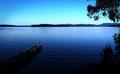
Our Lakeby owenComment by Pedxer: Good subject sizing, placement, color, and focus. This should do well all around. |
| Photographer found comment helpful. |
| 10/05/2005 11:41:34 PM |
Our Lakeby owenComment by wad4ever: I like this photo. Makes me want to dive in and swim to the middle. :) |
| Photographer found comment helpful. |
| 10/05/2005 09:51:31 PM |
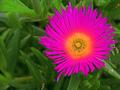
Thank Youby owenComment by mandyturner: *Critique Club*
Flowers are a great choice for Thank You cards. They are pretty and simple. I like the fact that you used ONE flower instead of a whole bunch. I read your comments and I am having a hard time seeing where you DE-SATURATED the photo? The colors of the greenery in the background is a nice bright green. The only problem I have with the BG is that some of it is in focus and some of it isn't. It would have been more appealing if it was one or the other. The actual bloom is extremely over-saturated to the point it looks painted. It does not look natural. I think that is what hurt your score the most. Oversaturating to make colors brighter and more vivid is good, but sometimes we can go too far and it looks fake. I think that is what happend here. It doesn't even look like it belongs in this photo, it looks like a piece of clip art that you pasted there. Photo processing can add so much appeal to a photo. But sometimes, I think most of the time with something as simple and naturally beautiful as a flower, it is best to leave the natural colors nature has blessed the bloom with.
I hope this was helpful, good luck in future challenges.
Mandy |
| Photographer found comment helpful. |
| 10/04/2005 01:06:07 PM |
|
| Photographer found comment helpful. |
| 10/03/2005 02:03:34 PM |
|
| Photographer found comment helpful. |
| 10/03/2005 12:44:33 PM |
Our Lakeby owenComment by SandyP: I love the perspective of the tiny fisherman in this. It's a very pretty scene. |
| Photographer found comment helpful. |
| 10/03/2005 11:56:11 AM |
Our Lakeby owenComment by messerschmitt: a bit too heavy on the blue for my taste nevertheless an ennnndlessly lovely view with nice details all around and subtile composed |
| Photographer found comment helpful. |
Home -
Challenges -
Community -
League -
Photos -
Cameras -
Lenses -
Learn -
Help -
Terms of Use -
Privacy -
Top ^
DPChallenge, and website content and design, Copyright © 2001-2026 Challenging Technologies, LLC.
All digital photo copyrights belong to the photographers and may not be used without permission.
Current Server Time: 07/17/2026 02:45:12 PM EDT.