| Image |
Comment |
| 05/31/2006 01:51:48 AM |
|
 Photographer found comment helpful. Photographer found comment helpful. |
| 05/31/2006 12:59:12 AM |
|
| Photographer found comment helpful. |
| 05/30/2006 11:41:48 PM |
|
| Photographer found comment helpful. |
| 05/30/2006 10:38:52 PM |
|
| Photographer found comment helpful. |
| 05/30/2006 08:08:21 PM |
|
| Photographer found comment helpful. |
| 05/30/2006 09:27:42 AM |
Couldn't catch a cold..by owenComment by LalliSig: Shot is pretty cool, like it a lot, reminds me of Roberts photos (Bear_Music) and that is meant as a compliment. Love the lighting in this shot. However, this doesn´t scream "failure" at me without the title so I "only" gave this an 8. |
| Photographer found comment helpful. |
| 05/29/2006 10:38:35 PM |
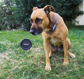
Can you do this?by owenComment by moniepenny: Hello from the critique club!
Well this is certainly an interesting photo to critique, I must say I don't really "get" it. Where is the stick? Is it hidden behind it? I know that it must be somewhere since cloning it out is not allowed under basic editing, so I'd be interested in hearing how this was accomplished exactly. It's really fooling me.
The lenscap is very nice, and crisp. The lighting on it is just right. The dog however seems to me a bit muted and low contrast. It almost appears as if they are two separate images, but I swear I am not accusing you of that, I am just saying that your allusion is done very well. : )
I'm not sure what to say about improving this since it appears to me that this is the look you were going for. My only suggestion would be perhaps playing with the levels or curves more to make the dog pop an extra bit without overdoing the lenscap, that might be a little difficult, but it could really add to the image in my opinion.
I like the crop and the placement of the lenscap and the dog in the image. All in all I feel that this is a strong photo and you should be proud of it.
Feel free to contact me if you have any questions/comments or concerns regarding this critique.
All the best,
Monica. |
| Photographer found comment helpful. |
| 05/29/2006 08:44:29 AM |
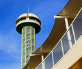
Observation Deckby owenComment by alfresco: I like the composition and the juxtaposition of the two elements. Eye flow is nice as well. Top of tower seems a little bright for me, maybe a little more constrast in fg / maybe not.... Nicely done, good luck! |
| Photographer found comment helpful. |
| 05/28/2006 05:59:13 PM |
|
| Photographer found comment helpful. |
| 05/28/2006 03:35:25 PM |
|
| Photographer found comment helpful. |
Home -
Challenges -
Community -
League -
Photos -
Cameras -
Lenses -
Learn -
Help -
Terms of Use -
Privacy -
Top ^
DPChallenge, and website content and design, Copyright © 2001-2026 Challenging Technologies, LLC.
All digital photo copyrights belong to the photographers and may not be used without permission.
Current Server Time: 07/23/2026 12:44:17 PM EDT.