|
|
Comments Received by eckoe
| Image |
Comment |
| 08/22/2005 12:50:12 AM | |  Photographer found comment helpful. Photographer found comment helpful. |
| 08/22/2005 12:45:07 AM | | | Photographer found comment helpful. |
| 04/03/2005 11:20:47 AM | |
| 04/03/2005 08:59:29 AM | What was I thinking?by eckoeComment by KaDi: A casual still life! Nice!
Duck (1): check. Grapes (5): check, check, check, check, check
Water: yes. Blue background (stupendously conceived from a Walmart bag): Ayup.
Light sources (3): hmm....sunlight? reflected light? and a little light-headedness? =) |
| 04/02/2005 06:29:12 PM | |
| 04/02/2005 12:15:22 PM | |
| 04/02/2005 02:25:41 AM | What was I thinking?by eckoeComment by tasha4paws: quack !quack !quack !quack !quack !quack !quack !quack !quack !quack !quack !quack !quack !quack !quack !quack !quack !quack !quack !quack !quack !quack !quack !quack !quack !quack !quack !quack !quack !quack !quack !quack !quack !quack !quack !quack !quack !quack !quack !quack !quack !quack !quack !quack !quack !quack !quack !quack !quack !quack !quack !quack !quack !quack !quack !quack !quack !quack !quack !quack !quack !quack !quack !quack !quack !quack !quack !quack !quack !quack !quack !quack !quack !quack !quack !quack !quack !quack !quack !quack !quack !quack !quack !quack !quack !quack !quack !quack !quack !quack ! quaaaaark |
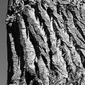
| 03/14/2005 09:56:30 AM | Closerby eckoeComment by Catbird: The picture as done in the link is much better. I don't dislike the first, but I must agree that it's out of focus and the sky was detractive (it took me a second to figure out what that grey thing was). The idea, bringing out detail, contrast, and texure, was very Ansel Adams, and I would have allowed a few points for that, and a few because I overall like the picture, minus the obvious flaws. I probably would have marked you a four on the first, and a seven on the second.
I'm surprised at so many 1s and 2s. I always reserved those for shots that make me say to myself, "Now what in the dickens was that photographer THINKING when hitting the shutter on this one?" This includes irrepairably technically horrendous stuff, 'what the heck does that have to do with anything' subjects (not simply 'well, it's a strech, but I see it'), or any other things that make 'One One One' or 'Two Two Two' flash in my head. Yours didn't. I could clearly see your aim, what you were thinking, and I feel it hit the theme right on the nose. Yes, there were some major technical flaws, and points needed subtracted for that, but was it a terrible picture? No. Brown Ribbon? I wouldn't have thought so.
-Annette | | Photographer found comment helpful. |
| 03/14/2005 01:41:38 AM | Closerby eckoeComment by eckoe: to those of you that commented, you're all right. There's something wrong with the way I'm reducing and editing images, either in the workflow and/or the software. I'm looking into learning a better workflow.
Fullsize better crop
Above link goes to the crop and detail that I wanted to see in the image, hopefully this would have scored better than the brown. It's twice the pixels, and the only thing that's been done with it is a slight curves, and convert to greyscale, then 1:1 cropped to 1280x1280.
Message edited by author 2005-03-14 02:23:25. |
| 03/14/2005 01:02:46 AM | Closerby eckoeComment by tolovemoon: I just dont see a need in voting anymore .... I tell ya I didnt but it if I had I wouldnt of gave it anyless then a 5. In fact thinking about Adams work and his history in photography this would of been one of those test images that noone would of seen for the comparison between b&W... I guess not everyone thinks like that. Better luck next time. |
Home -
Challenges -
Community -
League -
Photos -
Cameras -
Lenses -
Learn -
Help -
Terms of Use -
Privacy -
Top ^
DPChallenge, and website content and design, Copyright © 2001-2026 Challenging Technologies, LLC.
All digital photo copyrights belong to the photographers and may not be used without permission.
Current Server Time: 07/15/2026 11:11:52 PM EDT.
|