| Image |
Comment |
| 10/23/2004 07:27:31 AM |
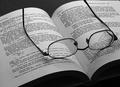
Why can't studies be simpler?by NitinComment by Artan: We must use the same optician as my specs look identical.
The diagonal works well in this but because you can only see the top sheets of the book it give an unbalanced feeling. I feel if you lit a little of the spine it would make it feel more like a book .
Revisiting I am looking at this on a different screen and can see all the spine, It would seem that my laptop at home is rather darker...Message edited by author 2004-10-27 03:11:40. |
 Photographer found comment helpful. Photographer found comment helpful. |
| 10/23/2004 06:37:41 AM |
|
| Photographer found comment helpful. |
| 10/20/2004 04:37:21 PM |
Why can't studies be simpler?by NitinComment by just-married: A bit of compression artifacts showing on the paper, but the composition is quite good. Still, even with the thought and care placed on framing the subject, you're right. It's just boring. may bump to a 6 later. 5, just-married |
| Photographer found comment helpful. |
| 10/20/2004 12:54:35 PM |
|
| Photographer found comment helpful. |
| 10/16/2004 10:22:09 AM |
|
| 10/14/2004 12:54:46 PM |
|
| Photographer found comment helpful. |
| 10/14/2004 12:03:42 PM |
|
| Photographer found comment helpful. |
| 10/14/2004 07:36:22 AM |
Mightier than the swordby NitinComment by MikeO: I think this would have been better if less of the pen was included, also there is something visible on the border above the e in Mercurty that distracts me. |
| Photographer found comment helpful. |
| 10/14/2004 07:18:33 AM |
|
| Photographer found comment helpful. |
| 10/13/2004 06:58:45 PM |
|
| Photographer found comment helpful. |
Home -
Challenges -
Community -
League -
Photos -
Cameras -
Lenses -
Learn -
Help -
Terms of Use -
Privacy -
Top ^
DPChallenge, and website content and design, Copyright © 2001-2026 Challenging Technologies, LLC.
All digital photo copyrights belong to the photographers and may not be used without permission.
Current Server Time: 07/16/2026 05:32:40 AM EDT.