DPChallenge: A Digital Photography Contest You are not logged in. (log in or register
 
Browse Settings
Currently viewing:
Registered UserNitin

Show comments:

Per page:

Order:

Comments:


Comments Received by Nitin
Pages:   ... ... [82]
Showing 301 - 310 of ~812
Image Comment
?
10/19/2005 09:54:54 PM
?
by Nitin

Comment by wee_ag:
Great use of color... really caught my eye.
Photographer found comment helpful.
?
10/19/2005 09:49:29 AM
?
by Nitin

Comment by Wilson Low:
Beautiful colors!
Photographer found comment helpful.
?
10/19/2005 12:49:34 AM
?
by Nitin

Comment by Leighroy:
What the...? Can't wait to find out what this is - nice image!
Photographer found comment helpful.
Don't drink and drive
10/11/2005 05:44:51 AM
Don't drink and drive
by Nitin

Comment by David.C:
I can see the fall -- stumbled on the way to the car, all bleary eyed (color cast) and dropped the keys and watched as the glass skidded across the floor spilling the last of your latest drink. The message is strong...

...Unfortunately it requires the viewer to read a lot into the image that simply isn't there without the title. Don't get me wrong, the composition that is here works -- the tilt of the tile and strong diagonal controlling the eye and giving a sense of being off-balance. But I feel it fails to provide a complete visual connection with the message -- which is likely what resulted in the lower than average score.

How to make it better? Well... Perhaps including more of the driving theme, such as placing the scene out on a driveway or street. Also, some portion or the person that took the spill could have been in the shot -- at least a hint of a presense, such as a shadow.

As it stands it is a good idea that was reasonably well executed -- but stands too much in isolation, relying on the title to prompt the viewer to fill in far too many gaps.

David
Critique Club
Photographer found comment helpful.
Don't drink and drive
10/04/2005 05:19:02 PM
Don't drink and drive
by Nitin

Comment by popdeepop:
Santa Clara. Ah. California. Long night for you. Interesting arrangement. Not sure how a glass survived hitting the tile floor. and these pools in a row. Good luck.
Photographer found comment helpful.
Don't drink and drive
10/04/2005 03:39:28 AM
Don't drink and drive
by Nitin

Comment by jvchuy:
I would have use a broken glass.
Photographer found comment helpful.
Don't drink and drive
10/02/2005 07:10:48 AM
Don't drink and drive
by Nitin

Comment by Emilio:
OKay this is a fantastic picture! This is the first picture I've seen in this category that needs to place. I love that the keychain has information for a collision center. This could very easily be an ad in a magazine or maybe even a high school or college newspaper. Congratulations, really...I'm rooting for you to take the blue ribbon!
Photographer found comment helpful.
Don't drink and drive
09/28/2005 10:25:45 PM
Don't drink and drive
by Nitin

Comment by kayd:
Creative play with the Collision Center noted on the key ring. The shifted angle supports your message, as well. Great advertisment for drinking / driving responsibly.
Photographer found comment helpful.
Don't drink and drive
09/28/2005 04:36:38 AM
Don't drink and drive
by Nitin

Comment by mimihoo:
Very good message!
Photographer found comment helpful.
Dream Retirement Location
09/27/2005 12:36:59 PM
Dream Retirement Location
by Nitin

Comment by karmat:
CRITIQUE CLUB CRITIQUE
by karmat

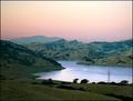
So, I have studied and looked, and looked and studied this shot. It is absolutely fabulous. The composition is great in that the lake leads the eyes into the shot, but not out of it. There are enough "layers" that it is interesting (land, water, mountains, sky), and they are not all strictly horizontal, so that makes it even stronger and interesting to me.

I, for one, like the power line in it because it adds a touch of "reality" to the scene.

Just a couple of little things that "might" make the shot stronger (I can state with certainty, because I didn't try it).

There is a slight halo on the hills in the background. Perhaps from your selection, or perhaps from the usm. It is neither bad nor good, imo, just noticeable.

The sky is still a little pale. I don't know if you could have darkened it more or not, but while it adds a nice contrast to the green, it is still a bit light. Maybe cropping the top 1/8 off or so would help?

And maybe if the foreground was bit lighter so the details were a bit more visible. On my monitor at work (horrendous) the foreground was almost black, and here at home, the monitor (pretty good) still shows it as being just a tad dark.

Overall, this is an awesome shot, and a very peaceful, serene one at that. Wish I was there at times!!!

karmat
Photographer found comment helpful.
Pages:   ... ... [82]
Showing 301 - 310 of ~812


Home - Challenges - Community - League - Photos - Cameras - Lenses - Learn - Help - Terms of Use - Privacy - Top ^
DPChallenge, and website content and design, Copyright © 2001-2025 Challenging Technologies, LLC.
All digital photo copyrights belong to the photographers and may not be used without permission.
Current Server Time: 08/25/2025 10:28:11 AM EDT.