| Image |
Comment |
| 08/22/2005 06:27:37 PM |
|
 Photographer found comment helpful. Photographer found comment helpful. |
| 08/22/2005 05:29:56 PM |
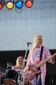
In the zoneby xylkeComment by mycelium: great expression on the guitarist's face, but too much other stuff in the picture distracting from it. could have used a tighter crop. |
| Photographer found comment helpful. |
| 08/21/2005 11:46:35 AM |
|
| Photographer found comment helpful. |
| 08/20/2005 05:55:50 PM |
|
| Photographer found comment helpful. |
| 08/19/2005 03:39:10 AM |
|
| Photographer found comment helpful. |
| 08/19/2005 01:57:20 AM |
In the zoneby xylkeComment by nsbca7: You cut off the guitar neck and the main subject appears to be looking out of the frame. Perhaps a horizontal would have been more apropriate. |
| Photographer found comment helpful. |
| 08/18/2005 01:08:24 PM |
In the zoneby xylkeComment by TheStick: Personally I would have crop'd the fuzzy lights off the top. A little distacting. |
| Photographer found comment helpful. |
| 08/17/2005 02:18:24 PM |
In the zoneby xylkeComment by BobsterLobster: Composition is all over the place, not sure what we're meant to be focusing on. Bassist looking out of the frame leads viewer's eye out of the photo. I'm missing the headstock on the bass. Placement of subjects in photo feels very unbalanced. |
| Photographer found comment helpful. |
| 08/17/2005 01:28:41 PM |
|
| Photographer found comment helpful. |
| 08/17/2005 11:33:23 AM |
|
| Photographer found comment helpful. |
Home -
Challenges -
Community -
League -
Photos -
Cameras -
Lenses -
Learn -
Help -
Terms of Use -
Privacy -
Top ^
DPChallenge, and website content and design, Copyright © 2001-2026 Challenging Technologies, LLC.
All digital photo copyrights belong to the photographers and may not be used without permission.
Current Server Time: 04/02/2026 07:27:15 AM EDT.