| Image |
Comment |
| 08/02/2004 01:36:37 AM |
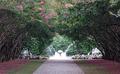
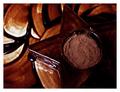
Formal Balance Fountainby annasenseComment by skylen: I like the composition a lot. I don't know why it's so blurry though. Part of it is probably that the JPEG compression is too high. The image is about 50KB, while you can use up to 150KB for your image. If you raise the quality setting when you save to the JPEG file, there will be much less loss of quality.
This is a very difficult scene to capture properly, though. The contrast between the bright fountain in the sunlight and the dark trunks of the trees means you'll have sacrifice either the dark areas or the bright areas to the hungry demon of lost details. You can use the exposure compensation feature of your camera to reduce the exposure and make the fountain more clearly exposed.
You have a good eye for composition! Practice, practice, practice! 8-) |
 Photographer found comment helpful. Photographer found comment helpful. |
| 08/02/2004 12:57:49 AM |
|
| Photographer found comment helpful. |
| 08/02/2004 12:21:01 AM |
|
| Photographer found comment helpful. |
| 08/01/2004 12:15:57 PM |
|
| Photographer found comment helpful. |
| 07/29/2004 02:55:44 PM |
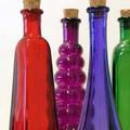
Colored Bottlesby annasenseComment by DCThiessen: Good idea you had here, I think there are two things that could have improved the shot. 1. Bump the saturation a bit to make the colors jump out at the viewer and 2. Try and make the background more white to contrast with the colors of the bottles. But, it is still a good entry as is. |
| Photographer found comment helpful. |
| 07/28/2004 11:50:59 AM |
|
| Photographer found comment helpful. |
| 07/28/2004 10:40:54 AM |
Colored Bottlesby annasenseComment by moodville: The background is good, focus isnt bad, the mix of colors is good too. I dont understand the composition, though. You have the green bottle cropped partly out and negative space on the left - it gives a feeling of unbalance to the composition. Personally, I think a different crop may have improved the impact some, the rest of the shot seems fine. |
| Photographer found comment helpful. |
| 07/28/2004 02:41:22 AM |
Colored Bottlesby annasenseComment by mocabela: I considered doing the same thing... have a bunch of these bottles myself :) Nice job; my only complaint is there seems to be some noise, or maybe just extra texturing on the green bottle. |
| Photographer found comment helpful. |
| 07/28/2004 12:48:27 AM |
|
| Photographer found comment helpful. |
| 07/27/2004 07:59:51 PM |
|
| Photographer found comment helpful. |
Home -
Challenges -
Community -
League -
Photos -
Cameras -
Lenses -
Learn -
Help -
Terms of Use -
Privacy -
Top ^
DPChallenge, and website content and design, Copyright © 2001-2026 Challenging Technologies, LLC.
All digital photo copyrights belong to the photographers and may not be used without permission.
Current Server Time: 07/16/2026 03:42:48 AM EDT.