| Image |
Comment |
| 03/14/2005 05:17:22 AM |
Simplicityby SDWComment by floyd: Nice and simple with the house nicely separated from the blackness around it. It's obvious but the biggest problem with this image is the tree that obscures the house. And the fact that it's hard to get rid of the tree doesn't stop it spoiling the image. Perhaps standing to the left and re-shooting would have helped. |
 Photographer found comment helpful. Photographer found comment helpful. |
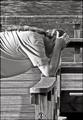
| 03/14/2005 05:12:24 AM |
Distraughtby SDWComment by floyd: This is an excellent scene that tells a real story. This is real photo journalism in the sense that you shot what you saw. The B&W is appropriate and adds to the newspaper feel.
There are a couple of problems with the shot. First of all your main subject is placed too centrally. There's a lot of dead space above the man's head. Also it would have been nice to see the whole scene by including his legs. I suspect that his whole body position showed his frustration and it would have been nice to capture all of it. That would also have framed the shot better.
I recognise, though, that your opportunity to shoot this was limited and you have to go with your instict or lose the moment. Well done on this one. Would have been a 7 or 8 from me. |
| Photographer found comment helpful. |
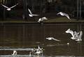
| 03/14/2005 05:06:53 AM |
Feeding the Ducks is for the Birdsby SDWComment by floyd: This is the most "snapshoty" of your images that I've seen so far. There's no real plan or framework to the elements in the image and so my eye hunts around without ever really stopping anywhere. The gulls in the foreground are both over exposed and unsharp due to their motion. The background and waldo are under exposed and muddy. |
| Photographer found comment helpful. |
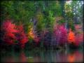
| 03/14/2005 05:03:30 AM |
Autumn Reflectionby SDWComment by floyd: This is a stunning shot and got lots of useful comments. It's an attractive scene that was enhanced with some sure handed post processing. You got the balance right here. If I have any suggestions for improvement it would be to try and bring back some of the detail in that very orange bush on the right. No other comments. Well done. This is a 9 from me. |
| Photographer found comment helpful. |
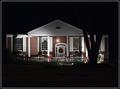
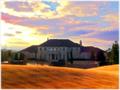
| 03/14/2005 05:01:00 AM |
DREAM HOMEby SDWComment by floyd: Wow - now this is an image that makes an impact. It reminds me of that awful Robin Williams movie "What Dreams May Come". It has an impressionistic style to it that I rather like.
It's an acceptable if not startlingly interesting scene but it's the post processing that make this shot an event. It would have been nice to see more light or more lightness on the front of the house to help that detail there. The sky is interesting but a little too hot on the left. The golden foreground is just stunning.
As an experimental shot I think there's a lot to enjoy about this and I hope you'll keep experimenting in this way. |
| Photographer found comment helpful. |
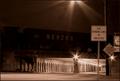
| 03/14/2005 04:57:42 AM |
CHANGING LANESby SDWComment by floyd: I like the stars on the streetlights but I'm finding little else in this image that really draws my eye. The street sign is there of course but once I've taken that in I find myself hunting for what I'm seeing in the rest of the image. It takes me a moment to figure out that it's a tunnel or a bridge with perhaps a train travelling over the top.
The usual lack of clarity problem is there and it's especially aparrent on the second street sign to the right of the main one. There's are blurred patches that make it difficult to read. |
| Photographer found comment helpful. |
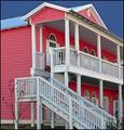
| 03/14/2005 04:51:49 AM |
Crimson and Cloverby SDWComment by floyd: Another well chosen scene. Good tonality and colour but slightly flat looking light. I think early morning or late evening light would have helped make the scene pop even more.
This shot is all about colour and you've done a good job of capturing the pink and contrasting it against the blue. In view of that I think your challenge score was unnecessarily low. Once again, though, I'm seeing a lack of detail, especially in the darker areas. For example I can barely see the edges on the pink boards in the lower right portion of the image.
It's becoming increasingly clear that either your camera or something about your technique is losing this detail since is seems to be a consistant thing from shot to shot. |
| Photographer found comment helpful. |
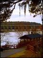
| 03/14/2005 04:46:13 AM |
OFFERING PASSAGE AS WE JOURNEYby SDWComment by floyd: Actually I would have liked the title "two bridges" - it's a clever play on the challenge title and it describes the image.
This is an excellently chosen scene. Well framed at the top and with good, interesting subjects for the eye to land on. I find my eye going back and forth between the two bridges.
There is a colour problem with this image, There's a clear red/brown cast to all the midtones and it's just visible in some of the sky highlights. And again there's a grainy lack of detail that I'm starting to suspect is down to your camera. |
| Photographer found comment helpful. |
| 03/14/2005 04:41:55 AM |
ONION'Sby SDWComment by floyd: This is an interesting idea for a submission but there are a couple of things that let it down. First of all there's a clear lack of detail, especially in the rings of the onion. I'm not sure if this is your camera or your post processing. The second thing is that although your lighting is good there are strong green shadows. This gives me the impression that either your white balancing is off or your post processing has been too harsh.
This is a shot I think would be worth re-shooting at some point. |
| Photographer found comment helpful. |
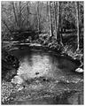
| 03/14/2005 04:38:45 AM |
Streamsby SDWComment by floyd: I scored this as an 8. It's well taken and the B&W conversion is good. If there is a problem it's that there isn't an identifiable subject for the eye to rest on. My eye hunts around the image but never really stops anywhere. Your scene is well framed, though and at no point is my eye led out of the image. |
| Photographer found comment helpful. |
Home -
Challenges -
Community -
League -
Photos -
Cameras -
Lenses -
Learn -
Help -
Terms of Use -
Privacy -
Top ^
DPChallenge, and website content and design, Copyright © 2001-2026 Challenging Technologies, LLC.
All digital photo copyrights belong to the photographers and may not be used without permission.
Current Server Time: 06/18/2026 01:59:42 AM EDT.