| Image |
Comment |
| 06/17/2006 05:57:04 AM |
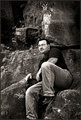
Southern Gentlemanby SDWComment by owen: I think it's a great shot. The tone, and expression and your background. Composition is pretty good but I would leave the foot in as well and have less spce at the top so for me tilting the camera down would have nailed this shot totally but I do still like it anyway it has a nice relaxed feel to it. |
 Photographer found comment helpful. Photographer found comment helpful. |
| 06/17/2006 05:27:57 AM |
Southern Gentlemanby SDWComment by tapeworm_jimmy: Great photo, and I really like the shading here. The jeans and the rocks have a similar texture, and it kinda makes you appear as one with the environment. Heres a rule of thumb that i try to stick to with cropping/composition: Never cut a person off at a joint (e.g ankle, wrist, elbow etc.). It normally gives the viewer an awkward feeling. This might explain the comments on the foot? Anyway, you have a great shot here, and this foot thing is pretty minute. Cheers! |
| Photographer found comment helpful. |
| 06/17/2006 04:36:30 AM |
Southern Gentlemanby SDWComment by DefyTime: I have to say I agree with them…even though it may not “disturb” me…I would like to see the other foot. I do like how you left a lot of negative space at the top that brings in more of the white from the rock and some leaves…overall great B&W image…great job. |
| Photographer found comment helpful. |
| 06/17/2006 04:12:18 AM |
Southern Gentlemanby SDWComment by ShutterPug: I feel the saem way - the missing foot disturbs me for some reason. I otherwise love the image. Wonderful b/w study - great textures. |
| Photographer found comment helpful. |
| 06/17/2006 12:05:28 AM |
Southern Gentlemanby SDWComment by brizmama: I really want to see your other foot. Don't know why. The comp is good and the B&W works well with the dark clothes and stone. Nice job. |
| Photographer found comment helpful. |
| 06/15/2006 11:59:56 PM |
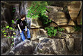
Near the Topby SDWComment by ShutterPug: Fantastic colors!. I really like the composition here. I dont think a tighter crop is really needed at all. This shows me not only your son, but the scenery he is taking in around himself.
I agree with the others that the shirt logo makes him look twisted a bit. Also, his arms are so pale in comparison to the shirt they almosy look like they were cut/pasted on. |
| Photographer found comment helpful. |
| 06/15/2006 11:44:58 PM |
Near the Topby SDWComment by klstover: I noticed that the way the shirt logo is, it almost looks like he is tilted a bit funny. But that's *after* I got over the fact that WOW is this a beautiful shot. |
| Photographer found comment helpful. |
| 06/15/2006 11:43:30 PM |
Near the Topby SDWComment by brizmama: The colors are awesome! Is there a way to better define his shirt I wonder? It makes him look slightly distorted but it could just be my monitor. |
| Photographer found comment helpful. |
| 06/15/2006 11:41:24 PM |
Near the Topby SDWComment by cpanaioti: Colours are great and the exposure and composition works for me.
However, a little separation between your son's head and the tree is needed. As it is it looks like the tree is growing out of his head. ;o) |
| Photographer found comment helpful. |
| 06/15/2006 11:39:18 PM |
Near the Topby SDWComment by Art Roflmao: Fantastic colors, Scott. Closer frame or tighter crop might be better to see your son. Well done. |
| Photographer found comment helpful. |
Home -
Challenges -
Community -
League -
Photos -
Cameras -
Lenses -
Learn -
Help -
Terms of Use -
Privacy -
Top ^
DPChallenge, and website content and design, Copyright © 2001-2026 Challenging Technologies, LLC.
All digital photo copyrights belong to the photographers and may not be used without permission.
Current Server Time: 06/21/2026 12:42:38 AM EDT.