| Image |
Comment |
| 08/08/2004 06:16:05 AM |
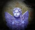
Blue Angelby pearcerComment by movieman: I think there's a little too much dead space at the top. So a tighter could make it a little stronger, in my opinion. I like it very much, though. 8. |
 Photographer found comment helpful. Photographer found comment helpful. |
| 08/05/2004 10:59:48 PM |
|
| Photographer found comment helpful. |
| 08/05/2004 05:28:44 AM |
Blue Angelby pearcerComment by skylen: I like the highlight on the face, that's a great touch.The background could be better though, I think the color is a little distracting from the nice blue of the angel. |
| Photographer found comment helpful. |
| 08/04/2004 01:57:54 PM |
|
| Photographer found comment helpful. |
| 08/04/2004 01:50:35 AM |
|
| Photographer found comment helpful. |
| 08/03/2004 11:23:04 PM |
Blue Angelby pearcerComment by dipaulk: I like the idea of the angel in the moonlight. I wonder how she would look against a darker blue, solid background? I've also read that statuary is good in B&W -- altho it wouldn't have worked well for this challenge. |
| Photographer found comment helpful. |
| 08/03/2004 10:19:58 AM |
|
| Photographer found comment helpful. |
| 08/02/2004 02:01:53 PM |
|
| Photographer found comment helpful. |
| 08/02/2004 03:04:19 AM |
Blue Angelby pearcerComment by Falc: Statue exposure is nice, composition... not too sure I like the centred focal point. Absolutely sure I don't like the vignette treatment. |
| Photographer found comment helpful. |
| 08/02/2004 12:33:35 AM |
|
| Photographer found comment helpful. |
Home -
Challenges -
Community -
League -
Photos -
Cameras -
Lenses -
Learn -
Help -
Terms of Use -
Privacy -
Top ^
DPChallenge, and website content and design, Copyright © 2001-2026 Challenging Technologies, LLC.
All digital photo copyrights belong to the photographers and may not be used without permission.
Current Server Time: 07/16/2026 03:49:09 AM EDT.