| Image |
Comment |
| 07/30/2002 01:39:00 AM |
|
| 07/29/2002 09:23:00 PM |
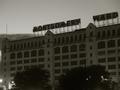
The Endby jkirkla1Comment by clicker: This could have been a terrific shot at perhaps a different time of day for better lighting. And perhaps a different angle to cut out the distracting trees and lights, just capturing the age and collapse of an empire... You had the idea, just not the time put into it... |
| 07/29/2002 01:22:00 PM |
The Endby jkirkla1Comment by mcrochip: Almost forgot about them. Dark and dreary, but little shy on contrast to make this a really stand-out photo. |
| 07/29/2002 10:54:00 AM |
The Endby jkirkla1Comment by Froober: I like the lighting in this photo...very ominious feeling to it. Possible improvements might include centering on the monkey wards sign, brightening a little to help out the contrast, and getting a perspective without the trees. Very strong on topic...good job! 7 Lisa |
| 07/29/2002 10:51:00 AM |
|
| 07/29/2002 09:45:00 AM |
The Endby jkirkla1Comment by Tracy: God it's been a long time seens I've see montgomery wards store bring's me back a hundred years. |
| 07/29/2002 05:21:00 AM |
The Endby jkirkla1Comment by LindaLee: This is exactly what I had in mind when I thought of the challenge. I like repeating patterns, and the overall "moody" feel. I think I would have liked it better with the lights at the bottom cropped out - the lights give it a "lived in" feel, and I would have liked a little bit more of a "dark, desolate" feel. lhall |
| 07/29/2002 03:17:00 AM |
The Endby jkirkla1Comment by jeremya: Difficult lightig situation... maybe spot metering the signage may have produced a better exposure |
| 07/29/2002 01:13:00 AM |
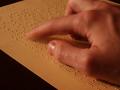
Dark and stormy nightby jkirkla1Comment by jkirkla1: Thanks for all the great comments on this. It was a fun shot to get and most people seemed to understood it. "Gotcha" got it the most (coincidence) - I was intentionally trying to capture in low light, as a visually impaired person doesn't need the same lighting that others might. It came out a bit on the yellow side (though the paper really is yellow). I probably should have adjusted the whitebalance a little more to see if it would reduce the yellow some and still give the same effect. This photo was unaltered in Photoshop aside from a little cropping to get rid of a crease in upper right side of the paper. |
| 07/28/2002 07:51:00 PM |
|
Home -
Challenges -
Community -
League -
Photos -
Cameras -
Lenses -
Learn -
Help -
Terms of Use -
Privacy -
Top ^
DPChallenge, and website content and design, Copyright © 2001-2026 Challenging Technologies, LLC.
All digital photo copyrights belong to the photographers and may not be used without permission.
Current Server Time: 07/15/2026 03:34:54 PM EDT.