| Image |
Comment |
| 12/11/2004 08:10:39 PM |
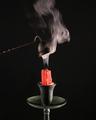
Goodnight !by graphicfunkComment by wewillexplore: The smoke is pretty cool in this. There seems to be a slight blur but that may be more smoke. My other nit is the composition - it's very centered left/right. However, I do like the smoke and the colors. It's a well captured image and I'm surprised a 5.7 score has only ONE comment. :)
Thanks for taking the time to comment on my shot as well. I appreciate the time a lot.
M |
 Photographer found comment helpful. Photographer found comment helpful. |
| 12/11/2004 06:03:05 PM |
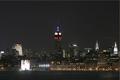
A Manhattan Nightby graphicfunkComment by Imagineer: Great exposure and a detailed, featured skyline - even with the high contrast subject (just love that architectural masterpiece, Chrysler building).
More Hudson and less sky would have guilded the lily nicely. : ) Message edited by author 2004-12-11 18:04:13. |
| Photographer found comment helpful. |
| 12/10/2004 08:48:07 PM |
|
| Photographer found comment helpful. |
| 12/10/2004 07:43:48 PM |
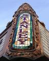
Stanley (1928) Jersey City, 2nd largest Theater E. of Mississipi Riverby graphicfunkComment by SDW: Your photograph seems to be slightly off center [bottom more to the left than the top]. I know we all talk about thirds but in this picture if feel as if 'STANLEY' would of been vertically in the middle given the picture an even flow outward would of been more apealing to the eye [imo]. However with that said I think you did a good job. I like the lighting, colors, shadows. As is [7] |
| Photographer found comment helpful. |
| 12/10/2004 11:04:22 AM |
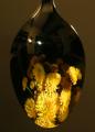
Reflections of a Spoonby graphicfunkComment by Dave Gordon: A very interesting concept, very well executed. I like the rendition of metallic reflections and the composition within the spoon. I think the background is too close to the color of the walls in the picture inside the spoon as it seems to make the image bleed out into the background. |
| Photographer found comment helpful. |
| 12/10/2004 08:27:11 AM |
|
| Photographer found comment helpful. |
| 12/10/2004 07:09:09 AM |
Reflections of a Spoonby graphicfunkComment by Skip: Composition: 7
Technical: 4
Appeal: 5
Challenge: 8
Overall Calculated Average Score: 6, this would have been killer if you had set it up without your kitchen in the reflection. too many distracting elements, especially the additional light sources |
| Photographer found comment helpful. |
| 12/09/2004 02:19:44 PM |
|
| Photographer found comment helpful. |
| 12/09/2004 11:40:59 AM |
Stanley (1928) Jersey City, 2nd largest Theater E. of Mississipi Riverby graphicfunkComment by e301: I guess that depends exactly how far east you're prepared to go, really. I can see the appeal of this light and tonality, which is well captured. I don't get the use of the odd angle, which seems neither a deliberate tilt nor an advantage. I like that you've tried a detail shot, rather than a dull full-on shot of as much of the building as you could get in ... but this seems oddly isolated. I think it's a composition thing: might you still have held the sign as your primary subject, but used the lines of the rest of the frontage, or rather 'some more' of the frontage, to bring the eye more strongly to that subject? |
| Photographer found comment helpful. |
| 12/09/2004 11:20:59 AM |
|
| Photographer found comment helpful. |
Home -
Challenges -
Community -
League -
Photos -
Cameras -
Lenses -
Learn -
Help -
Terms of Use -
Privacy -
Top ^
DPChallenge, and website content and design, Copyright © 2001-2026 Challenging Technologies, LLC.
All digital photo copyrights belong to the photographers and may not be used without permission.
Current Server Time: 07/25/2026 04:29:27 PM EDT.