| Image |
Comment |
| 04/25/2005 11:23:29 AM |
Gruenby graphicfunkComment by DustDevil: Love the colors. Background is right on. Nice color to the text and very well postioned. I gave it an 8. |
 Photographer found comment helpful. Photographer found comment helpful. |
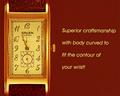
| 04/25/2005 07:08:17 AM |
Gruenby graphicfunkComment by Matthew: Nice image. not to my taste. Text does not feel "right": not enought of it to look like an advert, but too much to act as a byline. Font does not fit the style of watch - watch is a bit fussy, font is plain and simple. |
| Photographer found comment helpful. |
| 04/25/2005 05:06:24 AM |
Gruenby graphicfunkComment by om10: great framing, the text colour matches the watch colour which I like. well done |
| Photographer found comment helpful. |
| 04/25/2005 04:44:38 AM |
|
| Photographer found comment helpful. |
| 04/25/2005 04:24:49 AM |
|
| Photographer found comment helpful. |
| 04/25/2005 02:14:03 AM |
Gruenby graphicfunkComment by DrJOnes: Ohhh I wish the text was not there!! Otherwize very well photographed watch. |
| Photographer found comment helpful. |
| 04/25/2005 02:00:28 AM |
|
| Photographer found comment helpful. |
| 04/25/2005 01:43:51 AM |
|
| Photographer found comment helpful. |
| 04/25/2005 12:59:47 AM |
Silly Girlsby graphicfunkComment by Brad: This still floors me.
Never figured this as one of yours Daniel. No tricks, no double-exposure (well is in an "different" way - LOL)
:)
|
| Photographer found comment helpful. |
| 04/25/2005 12:29:07 AM |
|
| Photographer found comment helpful. |
Home -
Challenges -
Community -
League -
Photos -
Cameras -
Lenses -
Learn -
Help -
Terms of Use -
Privacy -
Top ^
DPChallenge, and website content and design, Copyright © 2001-2026 Challenging Technologies, LLC.
All digital photo copyrights belong to the photographers and may not be used without permission.
Current Server Time: 06/12/2026 06:18:28 PM EDT.